
Choosing yarn colors for a crochet textured blanket is all about balancing touch, tone, and atmosphere. The most beautiful palettes make stitches feel deeper, softer, and more intentional, whether you love creamy neutrals, earthy shades, coastal softness, or moody accents. These color ideas highlight fresh palette trends while helping you create a blanket that feels cozy, modern, and beautifully handmade.
Warm Oatmeal Neutrals
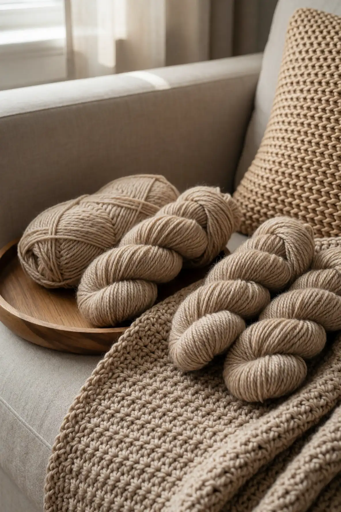
Warm oatmeal yarn is a beautiful starting point for a textured crochet blanket because it feels soft, natural, and easy to live with. Unlike stark white, oatmeal has gentle depth that helps raised stitches, bobbles, cables, and ribbed patterns appear more dimensional. It works especially well in relaxed bedrooms, cozy living rooms, and spaces filled with linen, wood, woven baskets, or handmade ceramics.
This shade also gives a blanket a timeless quality, making it ideal if you want a piece that will not feel dated. Pair oatmeal with cream for a quiet layered palette, or mix it with taupe and cocoa for a warmer handmade look. In textured crochet, even a simple stitch pattern can feel elevated when the color has this subtle natural warmth.
Mushroom Taupe for Quiet Texture
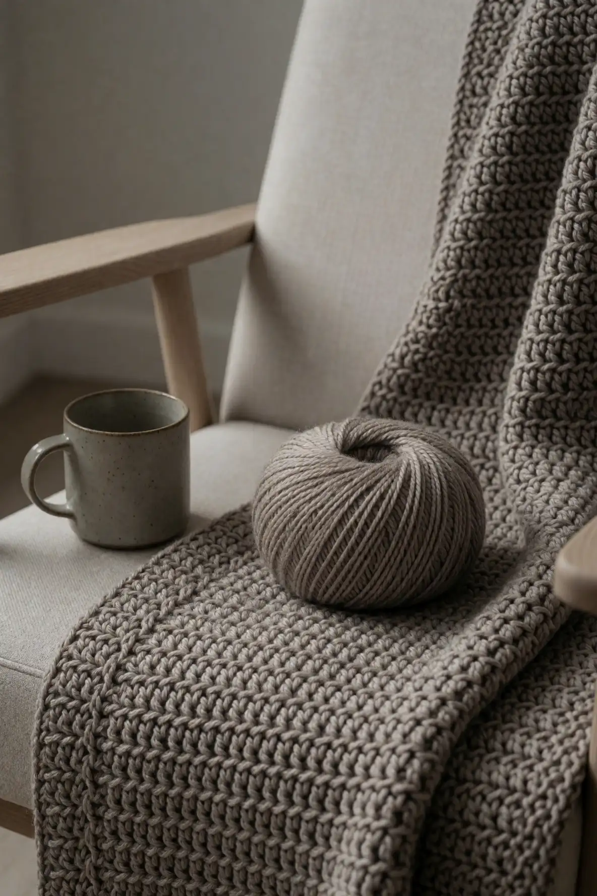
Mushroom taupe is a refined neutral that sits beautifully between gray, beige, and soft brown. It has enough shadow to show off texture, but it still feels calm and understated. For crochet blankets with dense stitches or sculptural patterns, mushroom yarn can make every ridge and curve look polished without becoming busy or overly decorative.
This color is especially lovely in minimal homes, earthy interiors, and spaces with stone, wood, or muted upholstery. It blends easily with cream, charcoal, sage, and clay, giving you room to create a balanced palette. If you want a blanket that feels cozy but sophisticated, mushroom taupe is a dependable choice with a soft modern edge.
Soft Clay and Terracotta Hues
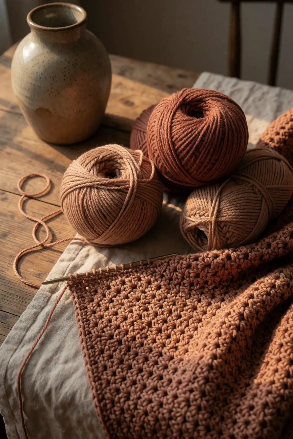
Soft clay and terracotta yarns bring warmth, character, and a subtle handmade charm to textured crochet. These shades feel sunbaked and earthy rather than overly bright, which makes them easier to use in a blanket meant for everyday comfort. They are perfect for stitch patterns that need visual richness, especially when the texture has raised details or layered rows.
Clay tones pair beautifully with cream, oatmeal, olive, rust, and dusty rose. They also add life to neutral rooms without overwhelming the space. If your home leans cozy, bohemian, rustic, or Mediterranean inspired, terracotta can make a crochet blanket feel deeply inviting. Choose a muted version for softness or a richer shade for a stronger focal point.
Dusty Rose with a Handmade Feel
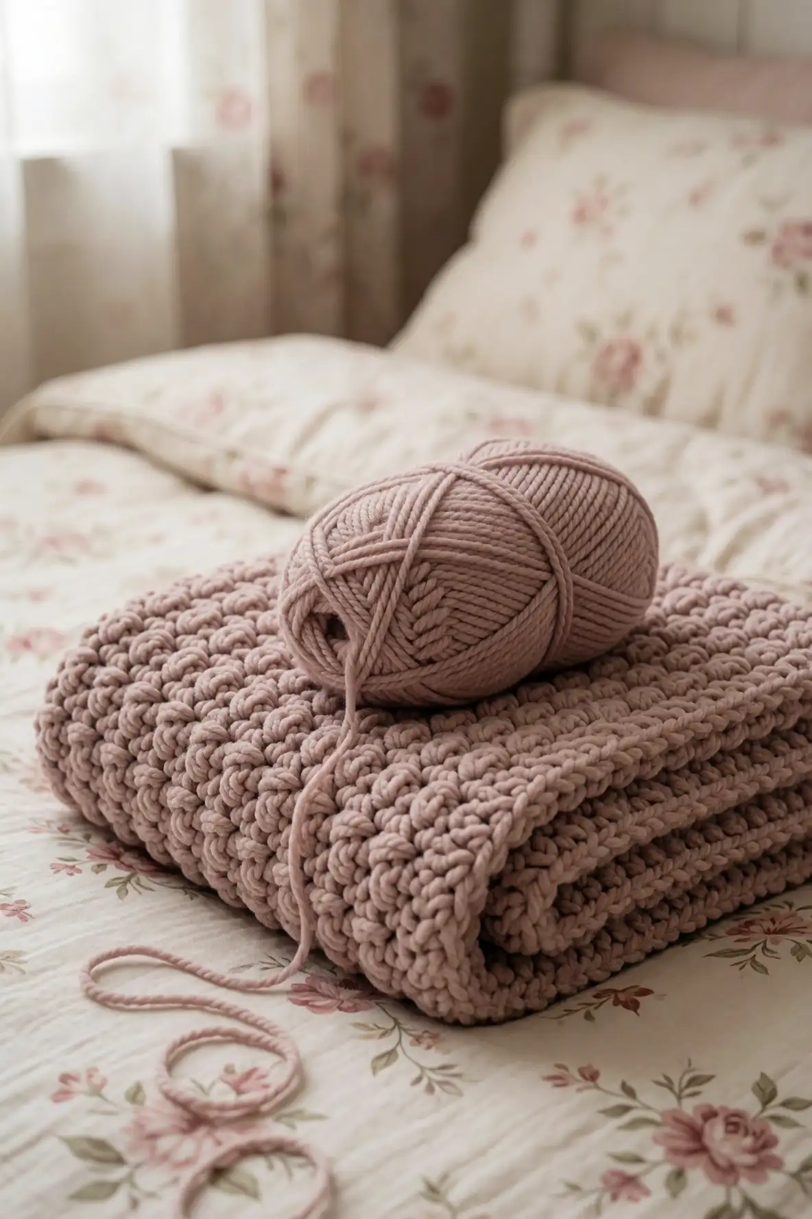
Dusty rose is a gentle color that adds warmth and romance to a crochet textured blanket without feeling overly sweet. It works beautifully when you want a soft feminine palette that still feels grown up and relaxed. The muted undertone keeps the color grounded, allowing textured stitches to shine while adding a cozy blush effect.
This shade pairs well with oatmeal, mushroom, cream, lavender, cocoa, and faded mauve. It is especially beautiful in bedrooms, reading corners, and soft living spaces where comfort matters most. In a blanket with popcorn stitches, puff stitches, or woven texture, dusty rose can make the finished piece feel delicate, personal, and inviting.
Muted Lavender for Gentle Contrast
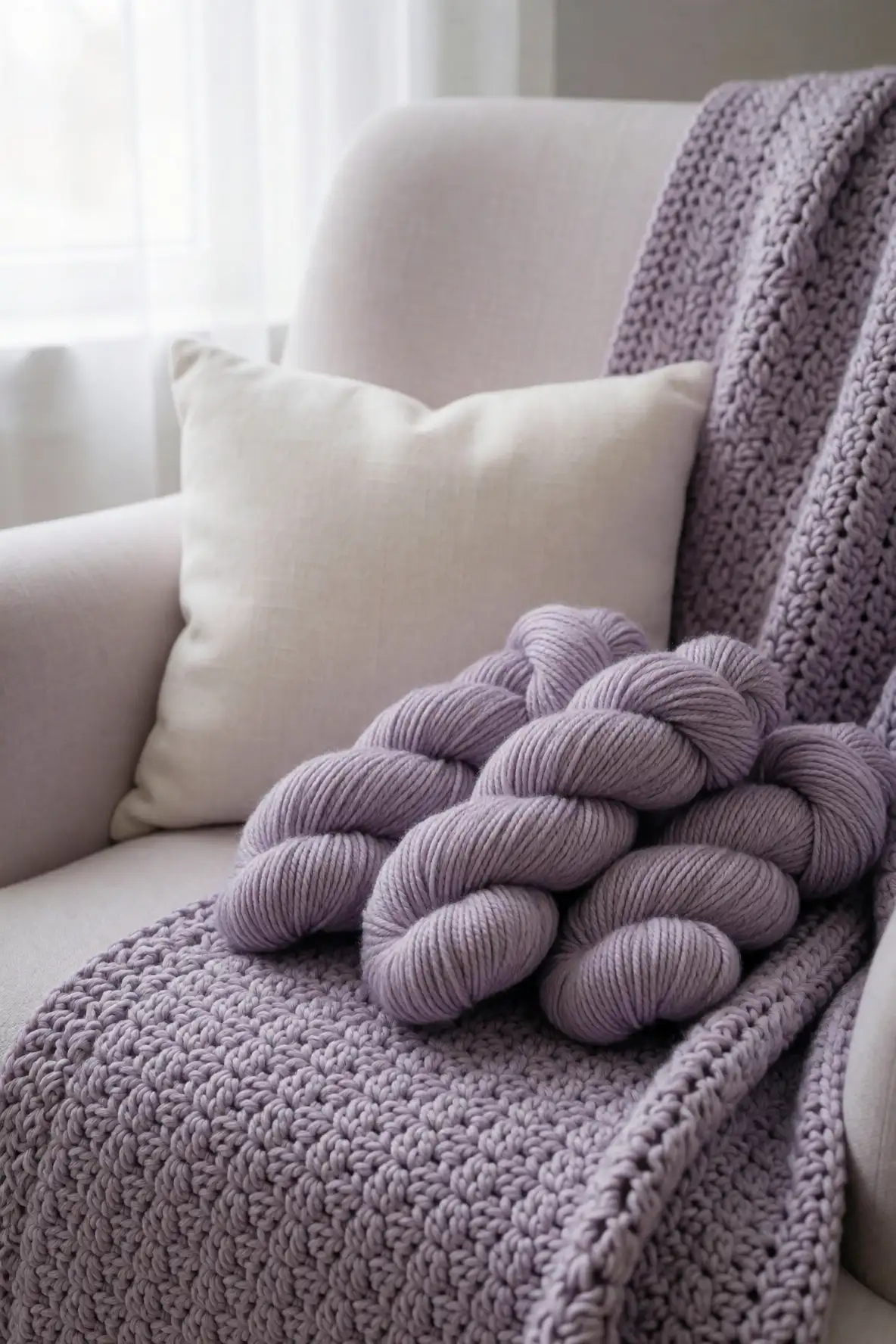
Muted lavender gives a crochet blanket a dreamy, calming quality while still feeling fresh. It is a softer alternative to cool gray and works well when you want color that feels peaceful rather than bold. In textured crochet, lavender can catch light in a lovely way, especially with plush yarns or stitches that create shadow.
This shade looks beautiful with cream, dusty rose, pale blue, sage, and soft taupe. It can also bring a gentle contrast to neutral rooms without disrupting the overall calm. For a blanket that feels soothing, elegant, and slightly whimsical, muted lavender is a thoughtful color choice that feels both cozy and quietly expressive.
Sage Green for Calm Crochet Layers
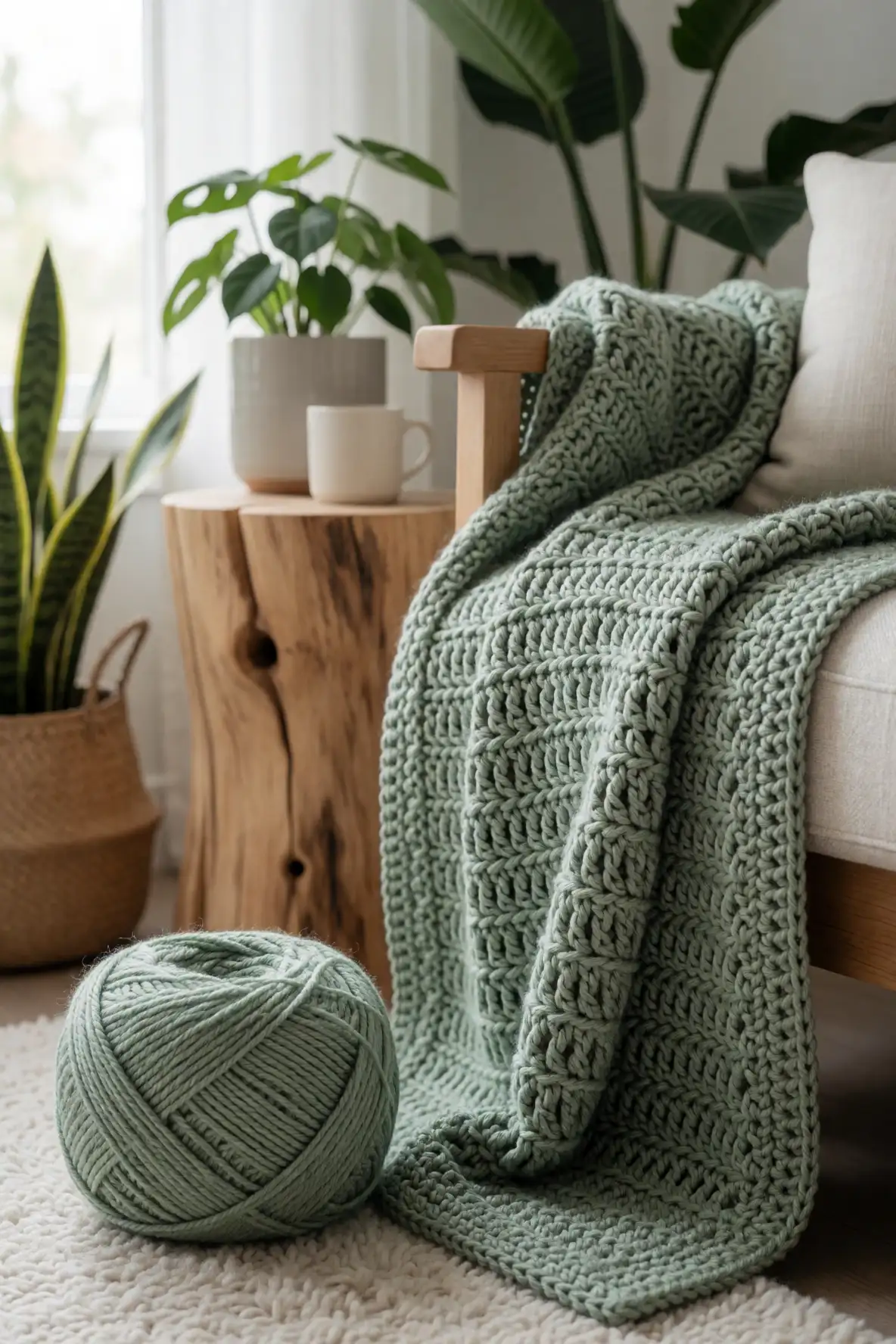
Sage green remains a favorite for handmade home pieces because it feels restful, natural, and easy to style. It adds color without shouting, which makes it ideal for textured crochet blankets meant to live on a sofa, bed, or reading chair. The muted green tone gives raised stitches a fresh but calming presence.
Sage pairs beautifully with oatmeal, cream, mushroom, olive, terracotta, and soft blue. It works especially well in rooms with plants, natural wood, woven rugs, and linen curtains. If your goal is a blanket that feels grounded and breathable, sage green offers the perfect mix of comfort, color, and modern softness.
Olive and Moss for Earthy Depth
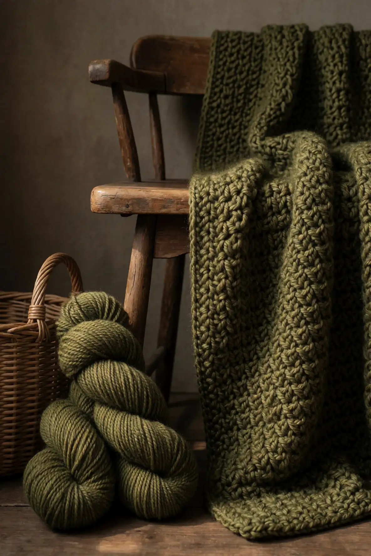
Olive and moss yarns bring a deeper botanical feeling to crochet textured blankets. These shades are richer than sage, making them ideal for cozy spaces that need more visual weight. They work beautifully with chunky stitches, basketweave textures, and dense patterns because the darker undertones emphasize shape and shadow.
For a balanced palette, combine olive or moss with cream, tan, cocoa, charcoal, or clay. These greens feel especially at home in autumn inspired spaces, cottage interiors, and rooms with vintage wood furniture. A blanket in this color family feels rooted, comforting, and quietly dramatic without losing its natural softness.
Buttercream Yellow for Subtle Warmth
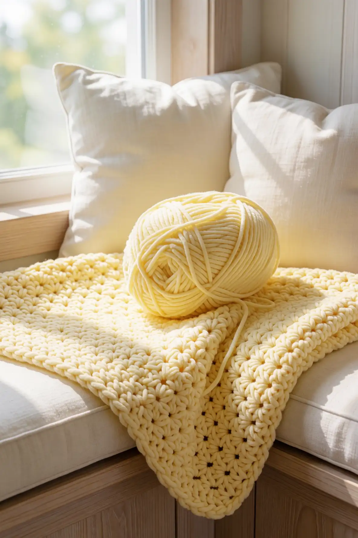
Buttercream yellow adds a soft glow to textured crochet without feeling too bright. It is warmer than cream but gentler than golden yellow, making it a lovely choice for blankets that need a cheerful yet calm personality. This shade can make a room feel lighter, especially when paired with cozy stitch patterns and soft yarn fibers.
Buttercream works beautifully with oatmeal, pale blue, sage, warm gray, and faded peach. It suits nurseries, guest rooms, sunlit corners, and cottage inspired spaces. If you want a blanket that feels comforting and optimistic, this mellow yellow brings warmth in a subtle way while still allowing texture to remain the focus.
Powder Blue for Airy Softness
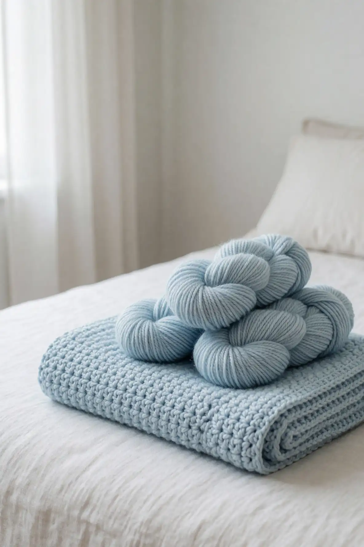
Powder blue is a light, airy yarn color that brings freshness to a textured crochet blanket. It feels clean without being cold, especially when the shade has a slightly softened undertone. In crochet, powder blue can make raised stitches look delicate and cloudlike, which is perfect for blankets designed for calm, serene spaces.
This color pairs naturally with cream, oatmeal, pale gray, seafoam, lavender, and sandy beige. It works well in coastal rooms, soft bedrooms, and bright living areas where a blanket should feel breezy but cozy. Powder blue is also a beautiful choice when you want color that feels peaceful, classic, and easy to style.
Stormy Blue for Cozy Evenings
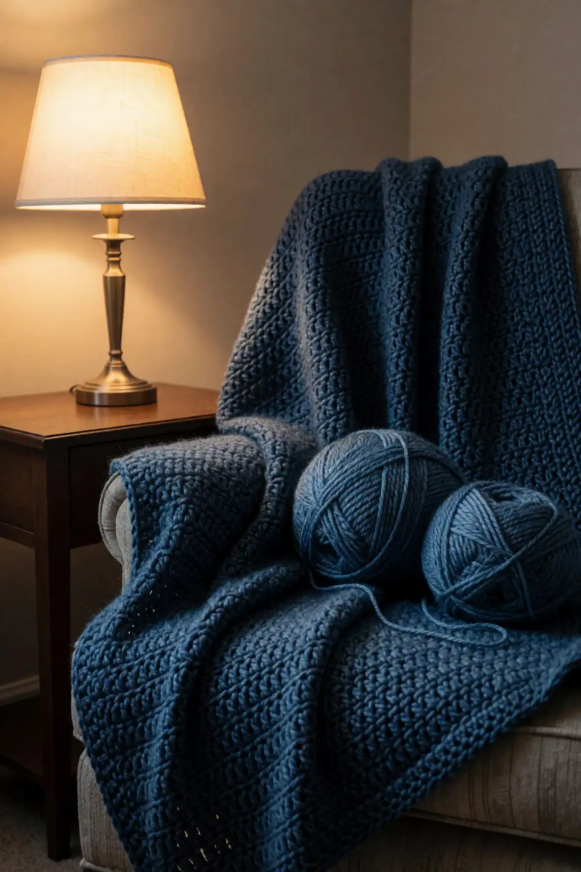
Stormy blue is a deeper, moodier option that gives a crochet textured blanket a comforting evening feel. It has the calm of blue with enough depth to make stitch definition stand out beautifully. This shade is especially effective in cable inspired crochet, waffle textures, ribbing, and plush patterns where shadows create drama.
Pair stormy blue with cream, warm gray, cocoa, sand, or muted green for a sophisticated palette. It works well in bedrooms, dens, and cozy living rooms where the blanket can act as a grounding accent. If pale colors feel too delicate for your space, stormy blue offers softness with a stronger presence.
Charcoal Gray with Luxe Definition
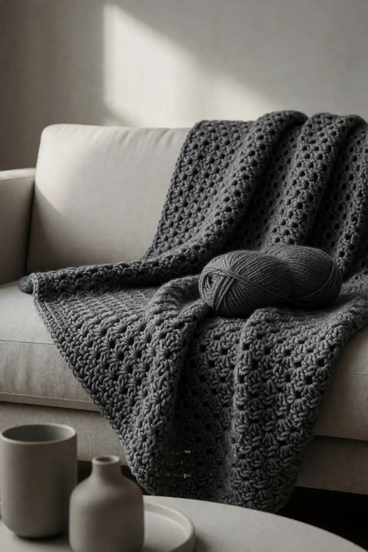
Charcoal gray is a striking choice for a crochet textured blanket because it highlights depth, shadow, and structure. It feels more dramatic than light gray, but it can still look refined when paired with plush yarn and careful stitch work. Textures such as ribs, cables, and raised clusters look especially crisp in charcoal.
This shade pairs beautifully with cream, oatmeal, taupe, clay, olive, and blackened blue. It can make a handmade blanket feel modern, polished, and even slightly luxurious. Charcoal is also practical for everyday use because it hides wear more easily than pale colors while still looking intentional and stylish.
Cream and Cocoa Pairings
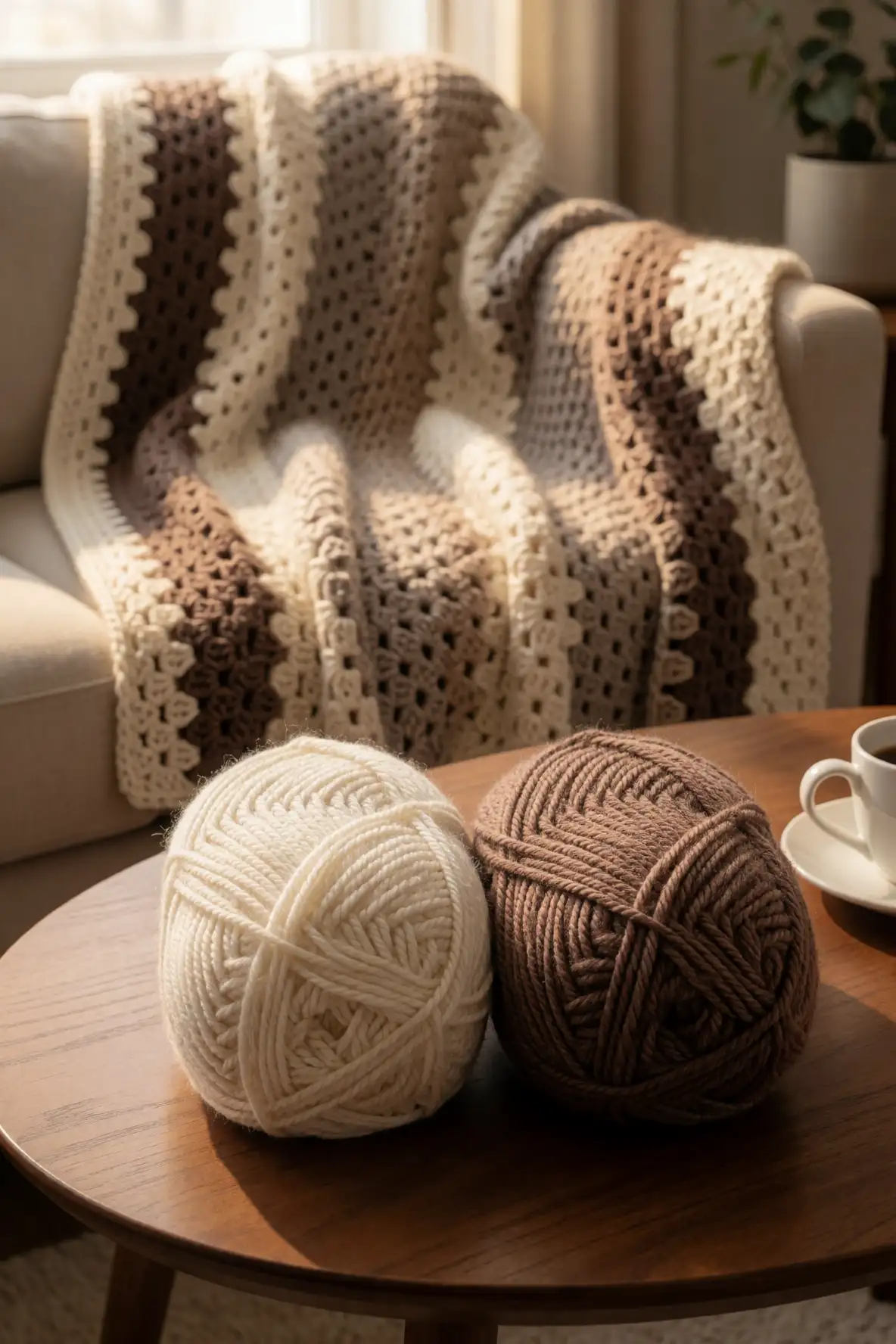
Cream and cocoa create a warm, comforting palette that feels like a cozy café in blanket form. Cream keeps the look soft and bright, while cocoa adds depth and richness. Together, they work beautifully in stripes, color blocking, borders, or textured panels where contrast helps the crochet pattern feel more visible.
This pairing is ideal for rustic, classic, and modern cozy interiors. It looks lovely with wood furniture, linen bedding, woven baskets, and neutral pillows. If you want a textured blanket that feels timeless and welcoming, cream and cocoa offer an easy palette that balances softness with enough contrast to keep the design interesting.
Greige Palettes for Minimal Homes
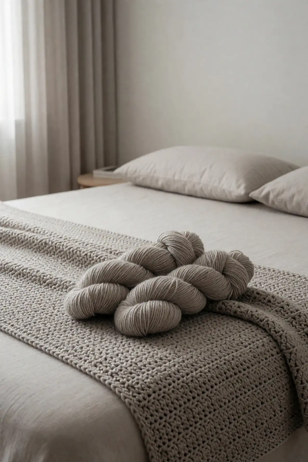
Greige is a beautiful blend of gray and beige, making it a natural fit for minimal homes and calm interiors. It has enough warmth to feel inviting and enough coolness to look clean. For textured crochet, greige helps stitch patterns appear refined rather than busy, which is perfect for simple but elevated blanket designs.
Use greige alone for a quiet monochrome look, or layer it with cream, stone, taupe, and charcoal for subtle dimension. This palette suits modern sofas, neutral bedding, and uncluttered spaces. If you love a soft home aesthetic, greige yarn can make a crochet blanket feel elegant, practical, and incredibly easy to style.
Moody Berry Accents
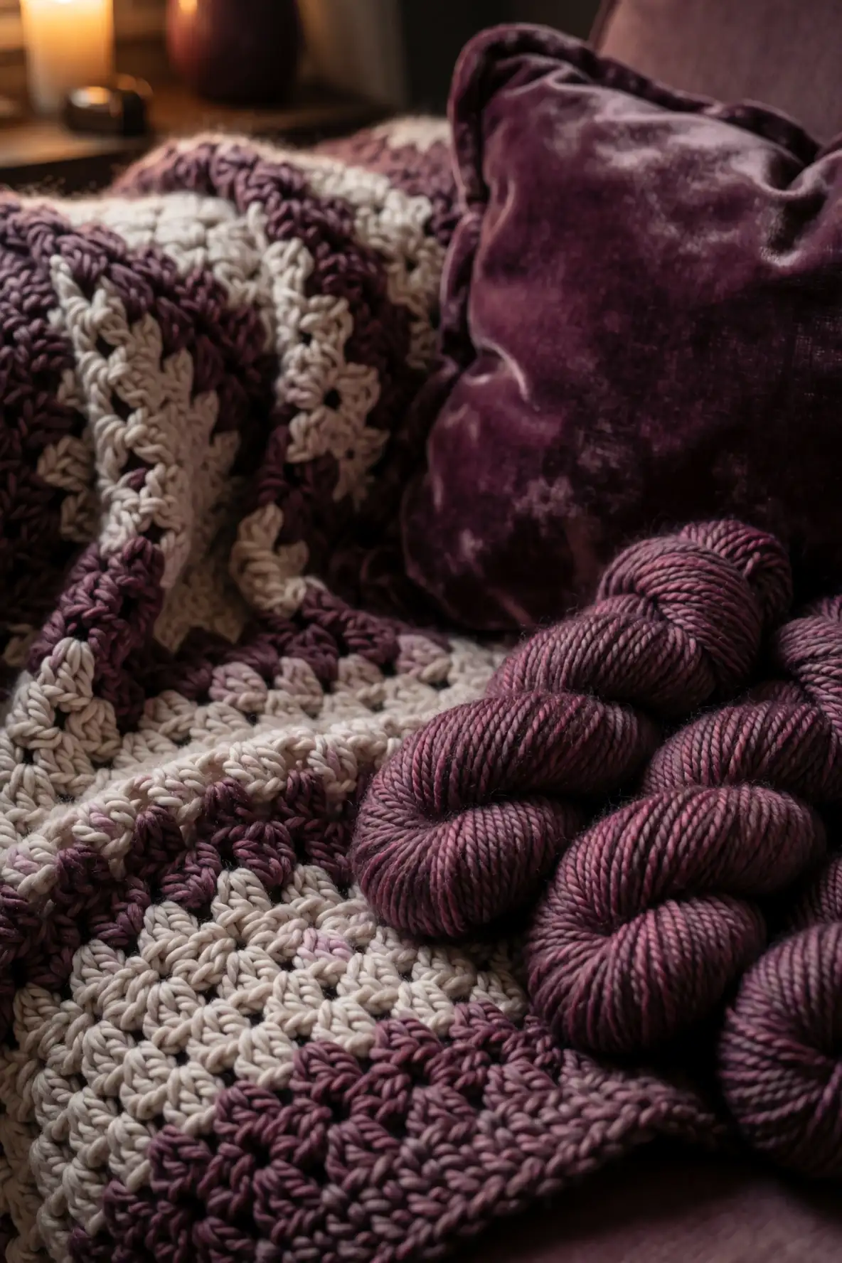
Moody berry yarn adds richness and personality to a crochet textured blanket without becoming overly bright. Shades like mulberry, plum, cranberry, and muted raspberry can bring warmth to neutral palettes and create a beautiful focal point. In textured stitches, these tones feel plush and expressive, especially when the yarn has a soft matte finish.
Berry accents pair beautifully with cream, charcoal, mushroom, dusty rose, navy, and cocoa. They work well as borders, stripes, motif details, or full blanket colors for a bolder handmade piece. If your space needs a touch of depth and romance, moody berry shades can make the blanket feel cozy, stylish, and memorable.
Coastal Sand and Seafoam Blends
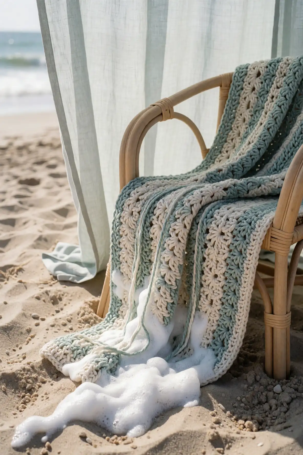
Coastal sand and seafoam create a relaxed palette that feels fresh, breezy, and softly natural. Sand brings warmth, while seafoam adds a gentle green blue note that keeps the blanket light. This combination is especially lovely for textured crochet because it feels calm but still offers enough contrast to show stitch movement.
Use these colors with cream, driftwood gray, pale blue, and oatmeal for a serene layered look. The palette suits beach inspired spaces, airy bedrooms, and sunlit living rooms. Even if your home is not coastal, sand and seafoam can bring a peaceful, spa like softness to a handmade crochet blanket.
Monochrome Tonal Yarn Families
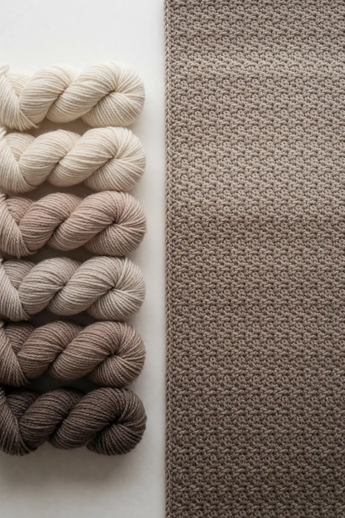
A monochrome tonal palette uses related shades from the same color family, creating depth without strong contrast. For textured crochet blankets, this approach is especially beautiful because it lets stitch detail lead while the color shifts add quiet interest. Think cream through oatmeal, sage through moss, or pale blue through stormy blue.
This method works well when you want a blanket that feels cohesive, calm, and designer inspired. Use the lightest shade for airy sections and the deepest shade for borders or grounding details. Tonal palettes are also forgiving, making it easier to blend yarns from different collections while keeping the finished blanket polished.
High Contrast Edges and Borders
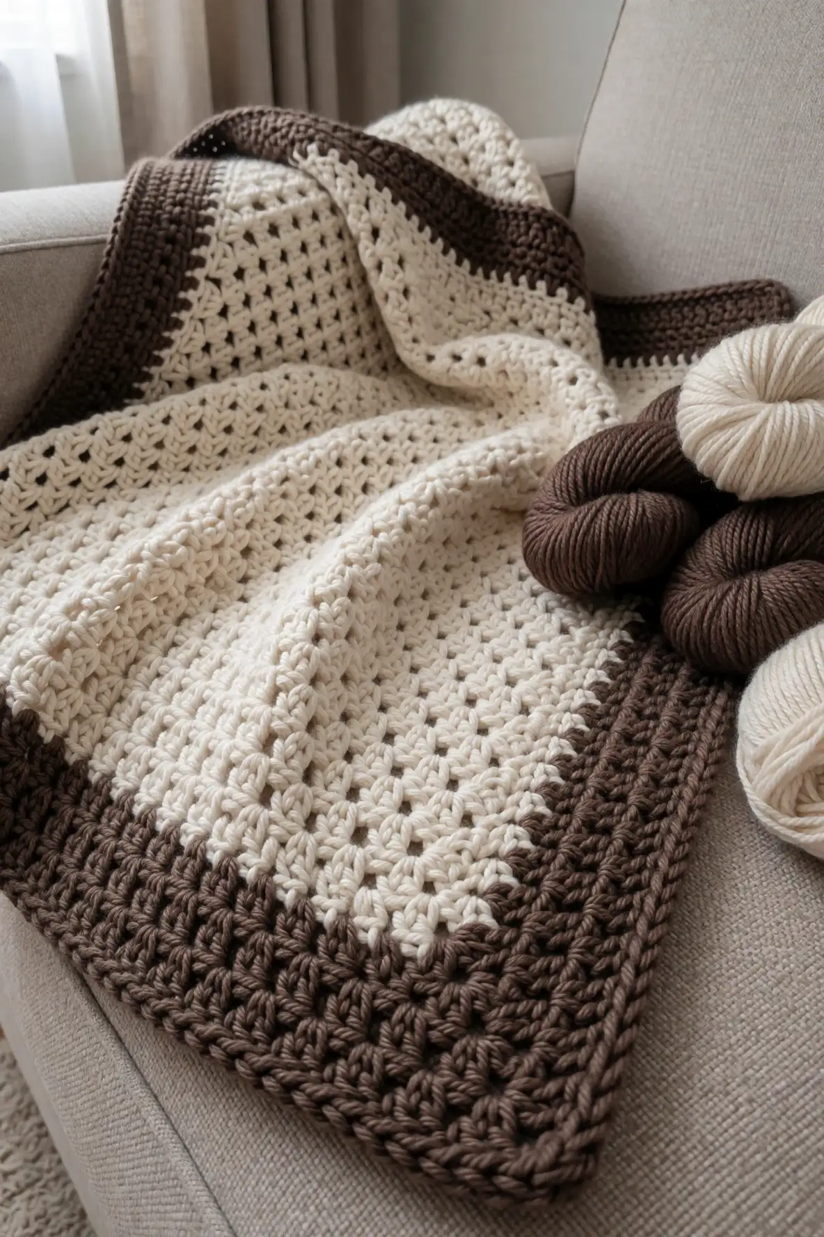
A high contrast border can completely change the look of a crochet textured blanket. Even if the main body is soft and neutral, a deeper edge in charcoal, cocoa, olive, or berry can frame the design and make it feel finished. This is especially useful when the blanket has subtle texture that benefits from definition.
Contrast does not have to feel harsh. Choose shades that share warmth or softness with the main palette so the border feels intentional. Cream with cocoa, sage with olive, or oatmeal with charcoal can all look balanced. A thoughtful edge adds structure, protects the visual shape, and gives the handmade piece a more tailored finish.
Choosing Colors for Your Room Mood
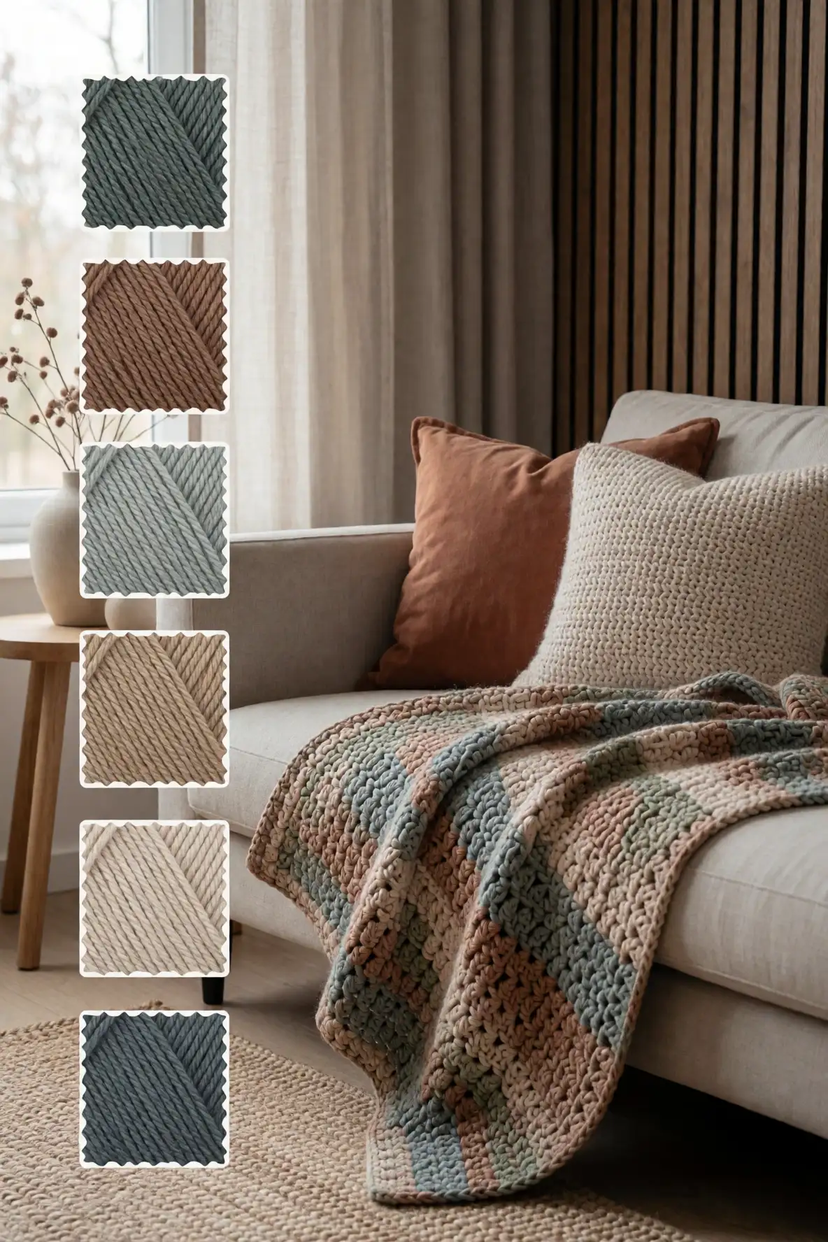
The best yarn color for a textured crochet blanket should connect with the mood of the room where it will live. A restful bedroom may call for oatmeal, lavender, sage, or powder blue. A cozy living room might feel better with cocoa, olive, clay, or charcoal. Let the space guide the palette instead of choosing color in isolation.
Look at the materials already in the room, including wood tones, wall color, rugs, pillows, and curtains. A blanket can blend gently with those elements or become a soft accent that adds warmth. When the color supports the room mood, the finished crochet piece feels natural, useful, and beautifully considered.
The most inspiring yarn colors for a crochet textured blanket are the shades that make texture feel alive while fitting naturally into your home. Whether you choose creamy neutrals, earthy greens, soft pastels, moody accents, or tonal blends, the right palette can turn a handmade blanket into a cozy piece you reach for every day.