Crochet textured blankets are having a beautifully cozy moment, with color palettes that feel softer, earthier, and more intentional than ever. The right combination can make bobbles, cables, ripples, waffle stitches, and chunky rows feel richer while turning a handmade blanket into a true decor accent for bedrooms, sofas, reading chairs, and gift baskets.
Warm Oatmeal and Soft Ivory
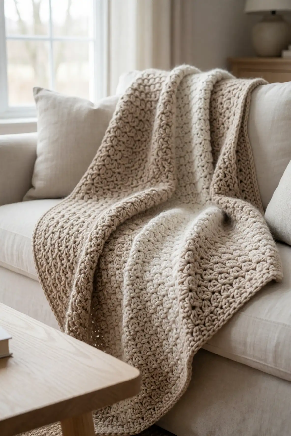
Warm oatmeal and soft ivory create the kind of crochet blanket that looks relaxed, expensive, and easy to style. This pairing is especially beautiful with textured stitches because the shades are close enough to feel calm, yet varied enough to reveal every raised loop and cozy ridge. It works well in farmhouse rooms, minimal bedrooms, creamy living spaces, and layered neutral corners where softness matters more than bold contrast.
Use oatmeal as the grounding shade and ivory as the brightening accent for borders, stripes, or alternating textured panels. The result feels handmade without looking busy, making it perfect for gifting or everyday home styling. Add it to a linen sofa, a wooden bench, or a bed with cotton sheets to create a gentle, natural look that feels cozy through every season.
Sage Green with Creamy Linen
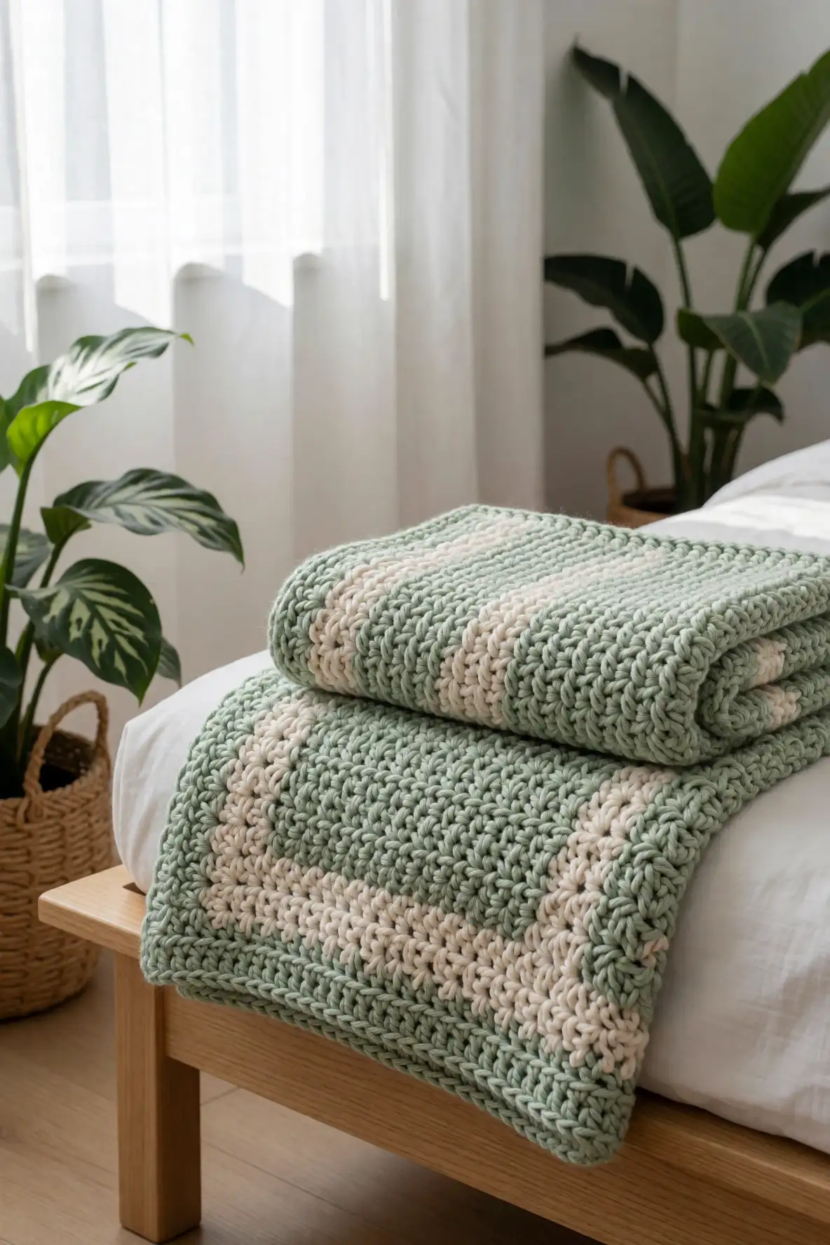
Sage green with creamy linen brings a fresh botanical softness to crochet blankets without feeling overly bright. The green adds a peaceful, nature-inspired mood, while creamy linen keeps the palette grounded and timeless. This combination is ideal for textured blankets with leaf-like stitches, soft ribbing, moss stitch, or gentle wave patterns because it gives the fabric a calm garden feeling.
This palette looks lovely in bedrooms with plants, light wood furniture, woven baskets, and soft white curtains. Sage can carry the main body of the blanket, while linen can define the border or highlight raised stitch sections. The overall effect feels restful and organic, making it a beautiful choice for anyone who wants a blanket that feels cozy, clean, and quietly refreshing.
Dusty Rose and Mushroom Taupe
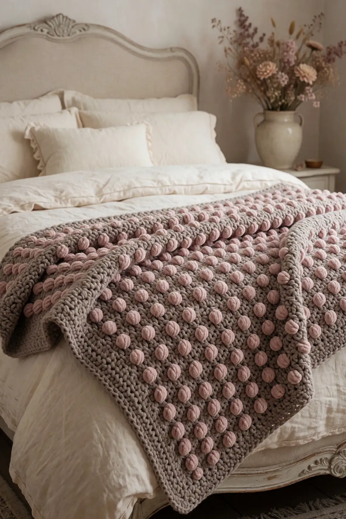
Dusty rose and mushroom taupe create a romantic crochet blanket palette that feels grown up, soft, and elegant. Dusty rose adds warmth and tenderness, while mushroom taupe keeps the look muted and earthy. Together, they make textured stitches feel dimensional without turning the blanket overly sweet, which is perfect for modern feminine spaces, vintage-inspired bedrooms, and cozy reading nooks.
This combination works especially well with puff stitches, bobble details, shell textures, and soft chevron patterns. Use taupe to tone down the rose and give the blanket a more refined look. Styled with cream bedding, brass accents, dried flowers, or a plush chair, this palette brings gentle charm into a room while still feeling calm enough for everyday comfort.
Clay Terracotta with Natural Cotton
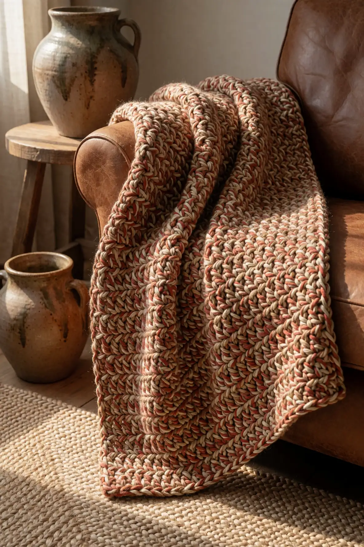
Clay terracotta with natural cotton gives crochet blankets a warm handmade look that feels earthy, grounded, and full of character. Terracotta brings a sunbaked warmth, while natural cotton softens the palette with a raw, simple brightness. This color combo is especially appealing for textured crochet because the warmth emphasizes stitch depth and makes the blanket feel rich without needing loud colors.
Try this pairing for chunky throws, waffle stitch blankets, and rustic striped designs. Terracotta can be used as the statement shade, while natural cotton can frame the edges or break up larger areas. It pairs beautifully with leather chairs, wood tones, ceramic decor, jute rugs, and neutral pillows, giving any room a relaxed artisan feeling that still looks polished.
Buttercream Yellow and Pale Beige
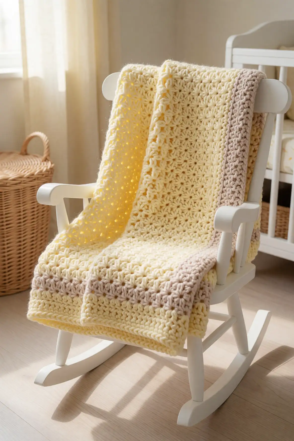
Buttercream yellow and pale beige make a crochet blanket feel cheerful, soft, and comforting without becoming too bright. Buttercream brings a gentle sunny quality, while pale beige keeps the palette grounded and wearable in a home setting. This is a lovely choice for nursery blankets, spring-inspired throws, guest rooms, or any space that needs a little warmth without strong contrast.
Textured stitches shine beautifully in this palette because both colors catch light in a delicate way. A buttercream border around a beige body feels subtle and sweet, while alternating textured bands create a soft glow across the blanket. Style it with white bedding, wicker storage, floral accents, or a pale wood rocker for a cozy look that feels happy and serene.
Blue Grey with Cloud White
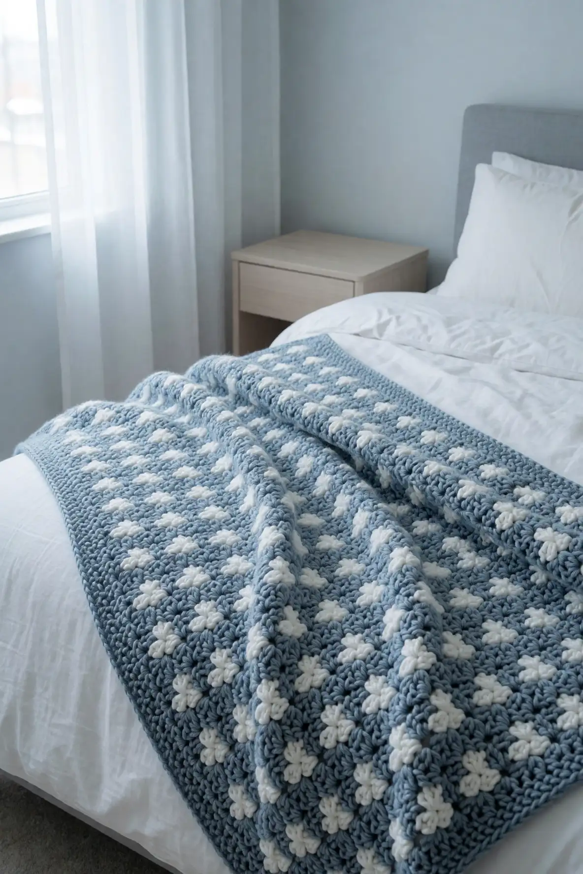
Blue grey with cloud white is a cool and calming crochet blanket color combo that feels clean, airy, and timeless. Blue grey adds a soft misty mood, while cloud white brings crispness and light. This pairing works beautifully for textured stitches because the gentle contrast highlights cable rows, ribbed edges, basketweave patterns, and plush raised details without making the blanket feel busy.
This palette is perfect for coastal bedrooms, peaceful guest rooms, and modern living spaces with pale wood, white walls, or silver accents. Use blue grey as the main shade for a tranquil base, then add cloud white through edging or pattern repeats. The finished blanket feels soothing, breathable, and quietly elegant, making it easy to style across different home aesthetics.
Olive Green and Toasted Almond
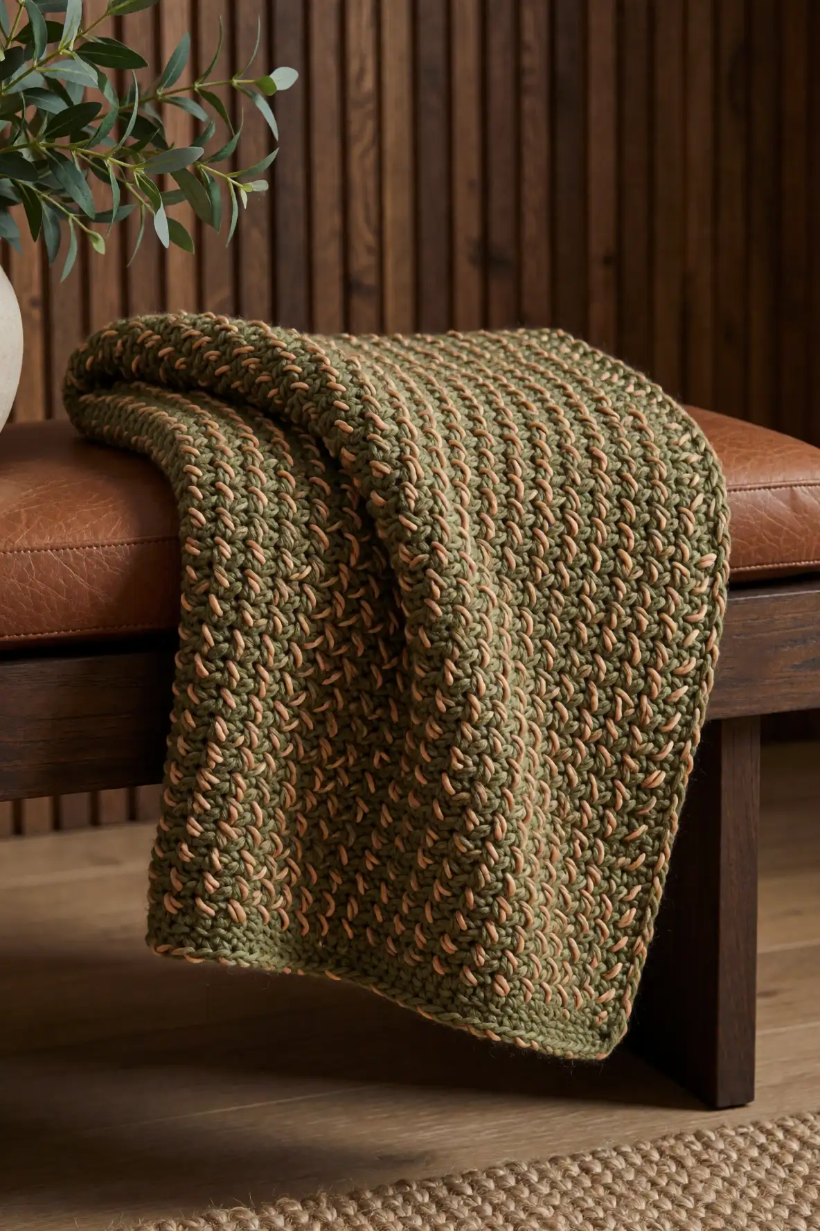
Olive green and toasted almond create a crochet blanket palette with depth, warmth, and subtle rustic charm. Olive feels grounded and natural, while toasted almond adds a soft golden neutrality that keeps the blanket inviting. This combination is ideal for textured crochet because it gives every raised stitch a rich, earthy shadow, especially in chunky yarn or wool blends.
Use this palette in spaces with dark wood, leather, warm neutrals, and indoor greenery. Olive can anchor the design, while toasted almond can soften borders, stripes, or textured blocks. The result feels cozy enough for a cabin-inspired room but polished enough for a modern home. It is a beautiful choice for anyone drawn to natural colors with a slightly moody edge.
Lavender Mist with Warm Stone
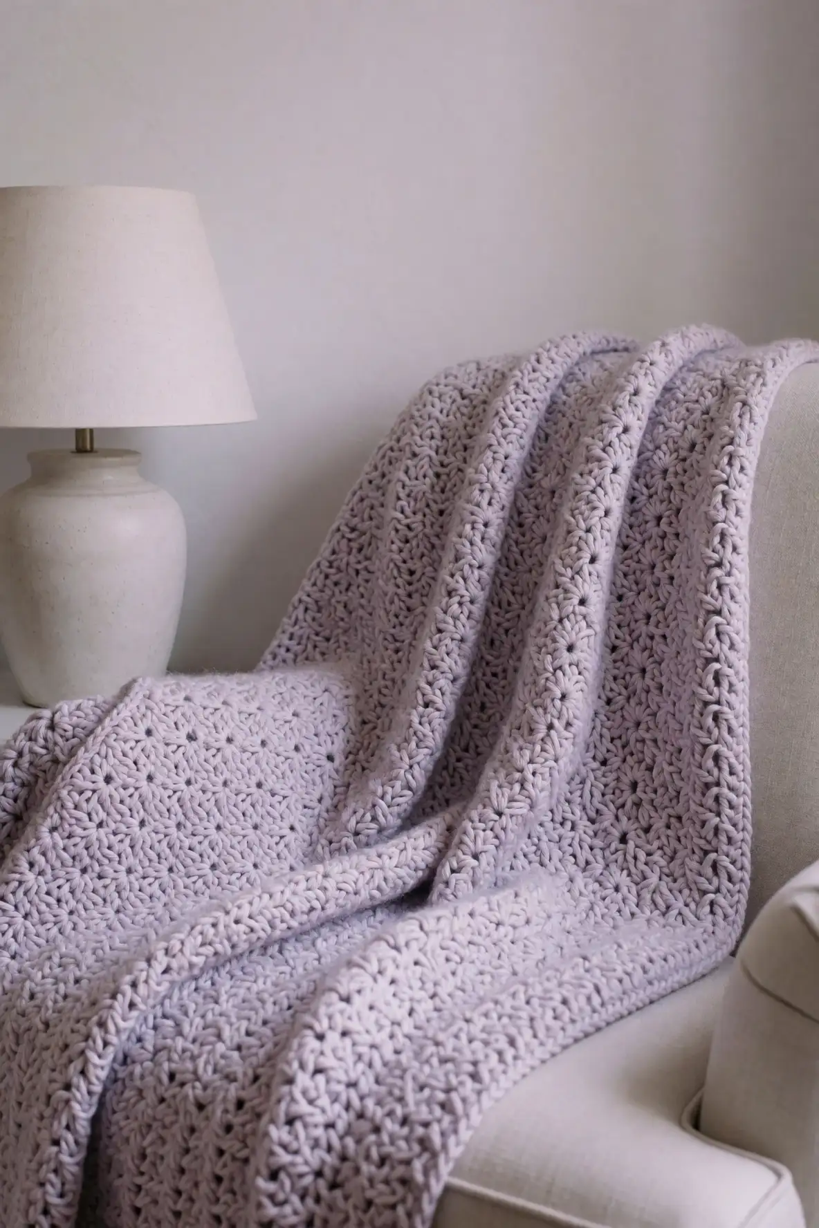
Lavender mist with warm stone offers a gentle, dreamy palette for crochet blankets that feel calm and quietly unique. Lavender mist brings a soft floral tone, while warm stone keeps the look grounded and sophisticated. This pairing is ideal for anyone who wants a hint of color without choosing a palette that feels too bright or overly seasonal.
It works beautifully with delicate textures such as shell stitch, soft ripples, seed stitch, and light bobbles. Warm stone can balance the lavender so the finished blanket feels serene rather than sugary. Style it with white bedding, muted artwork, ceramic lamps, or a soft upholstered chair to create a peaceful corner that feels restful, pretty, and effortlessly cozy.
Charcoal Grey and Winter Cream
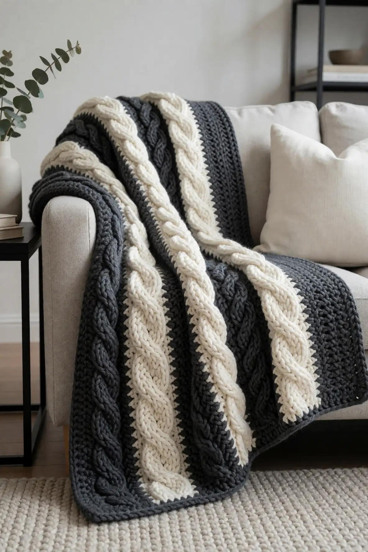
Charcoal grey and winter cream create a crochet blanket with bold contrast while still feeling soft and classic. Charcoal adds drama and depth, while winter cream keeps the palette cozy and bright. This is a strong choice for textured blankets because darker yarn brings out shadows in cables, ridges, and raised stitches, while cream highlights the pattern clearly.
This combination suits modern sofas, masculine bedrooms, Scandinavian-inspired homes, and minimalist spaces that need texture more than color. Use charcoal for the body and cream for edging if you want a grounded look, or alternate the shades for a graphic handmade statement. The result feels timeless, warm, and stylish without relying on trendy colors that may fade from view.
Cocoa Brown with Blush Pink
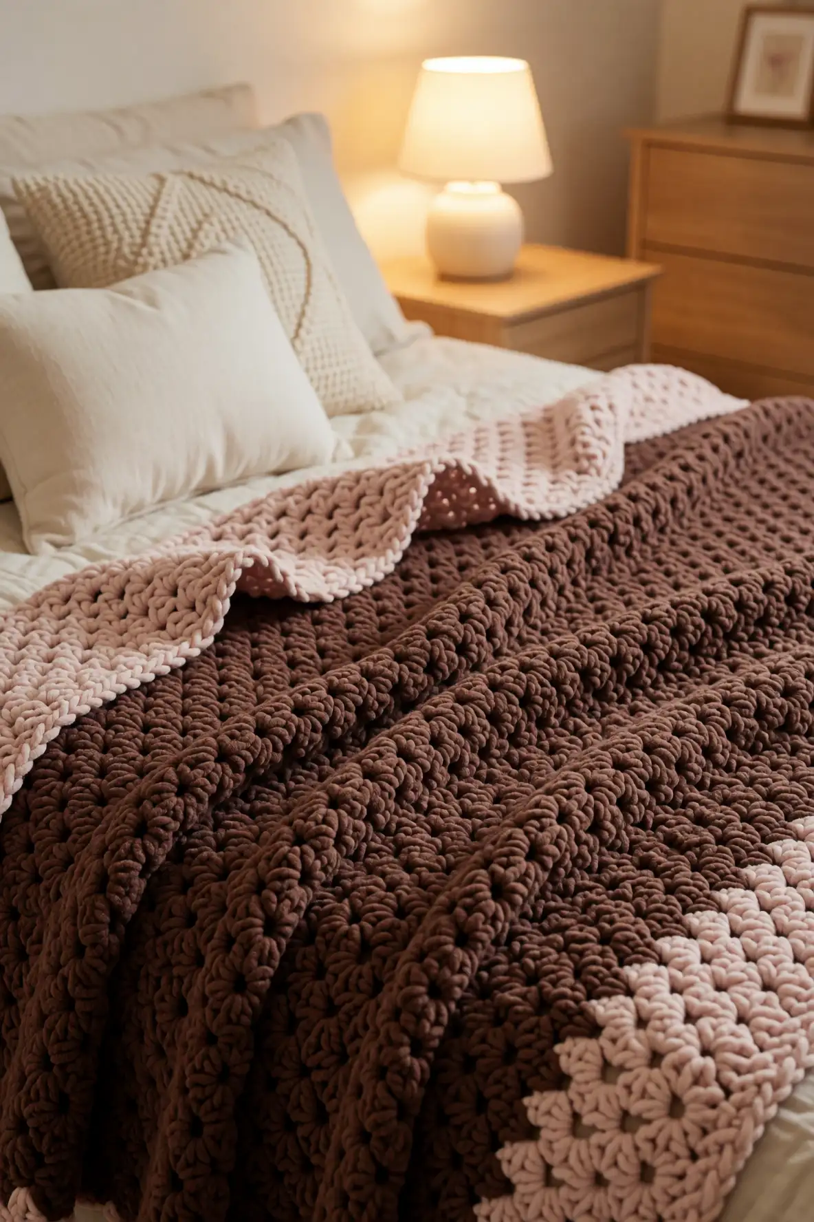
Cocoa brown with blush pink creates a cozy crochet blanket palette that feels sweet, rich, and surprisingly modern. Cocoa brings warmth and comfort, while blush pink adds softness and charm. Together, they create a balanced look that is romantic without feeling delicate, making it a lovely choice for bedrooms, reading chairs, and layered sofa styling.
This palette looks especially beautiful in plush yarns, velvet-like fibers, and textured stitches with rounded details. Cocoa can make the blanket feel grounded, while blush can brighten borders, panels, or decorative rows. Pair it with cream pillows, wood furniture, soft lighting, and warm metallic accents for a comforting look that feels handmade, pretty, and full of quiet personality.
Seafoam Green and Vanilla
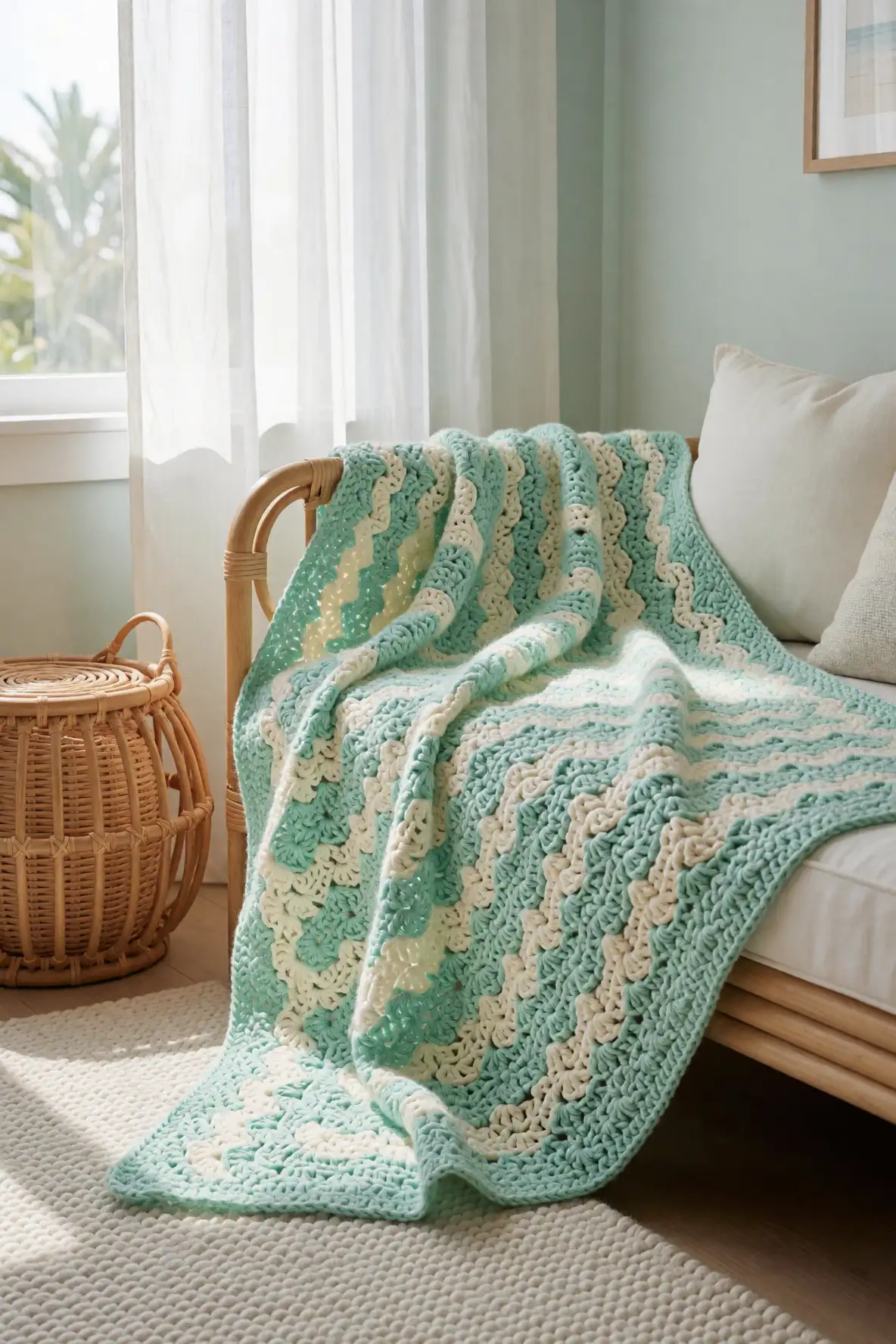
Seafoam green and vanilla create a fresh crochet blanket palette with a light, breezy feeling. Seafoam brings a gentle coastal tone, while vanilla adds creamy warmth so the combination does not feel cold. This pairing is wonderful for textured crochet because it keeps the finished blanket airy while still showing stitch definition in a soft and inviting way.
Use seafoam for relaxed stripes, ripple sections, or the main blanket body, then bring in vanilla for contrast and softness. It pairs well with white furniture, rattan, pale wood, linen curtains, and glass decor. The finished blanket feels peaceful and refreshing, making it a lovely choice for a sunroom, guest bed, baby blanket, or calm living room corner.
Rust Orange with Soft Sand
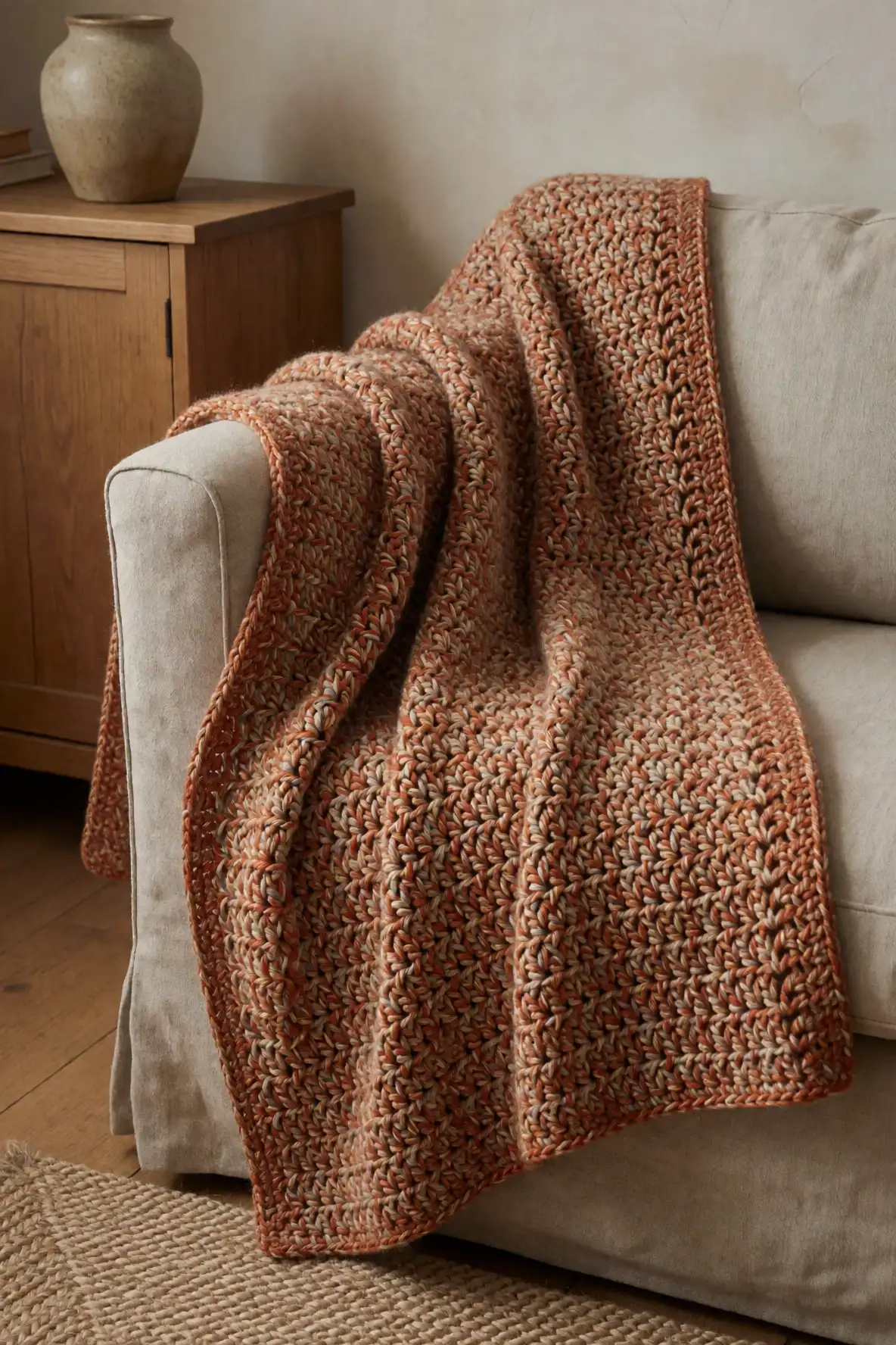
Rust orange with soft sand is warm, earthy, and full of cozy personality. Rust gives a crochet blanket a rich autumnal glow, while soft sand lightens the palette and makes it easier to style. This combination is perfect for textured stitches because the orange adds energy and depth, while the sand shade keeps the overall design balanced.
This palette works beautifully for blankets placed over neutral sofas, leather chairs, wood benches, or beds layered with cream linens. Use rust as an accent if you want subtle warmth, or let it lead the design for a bolder handmade piece. Soft sand borders, stripes, or textured panels can keep the finished blanket relaxed, natural, and inviting.
Mauve Plum and Heather Grey
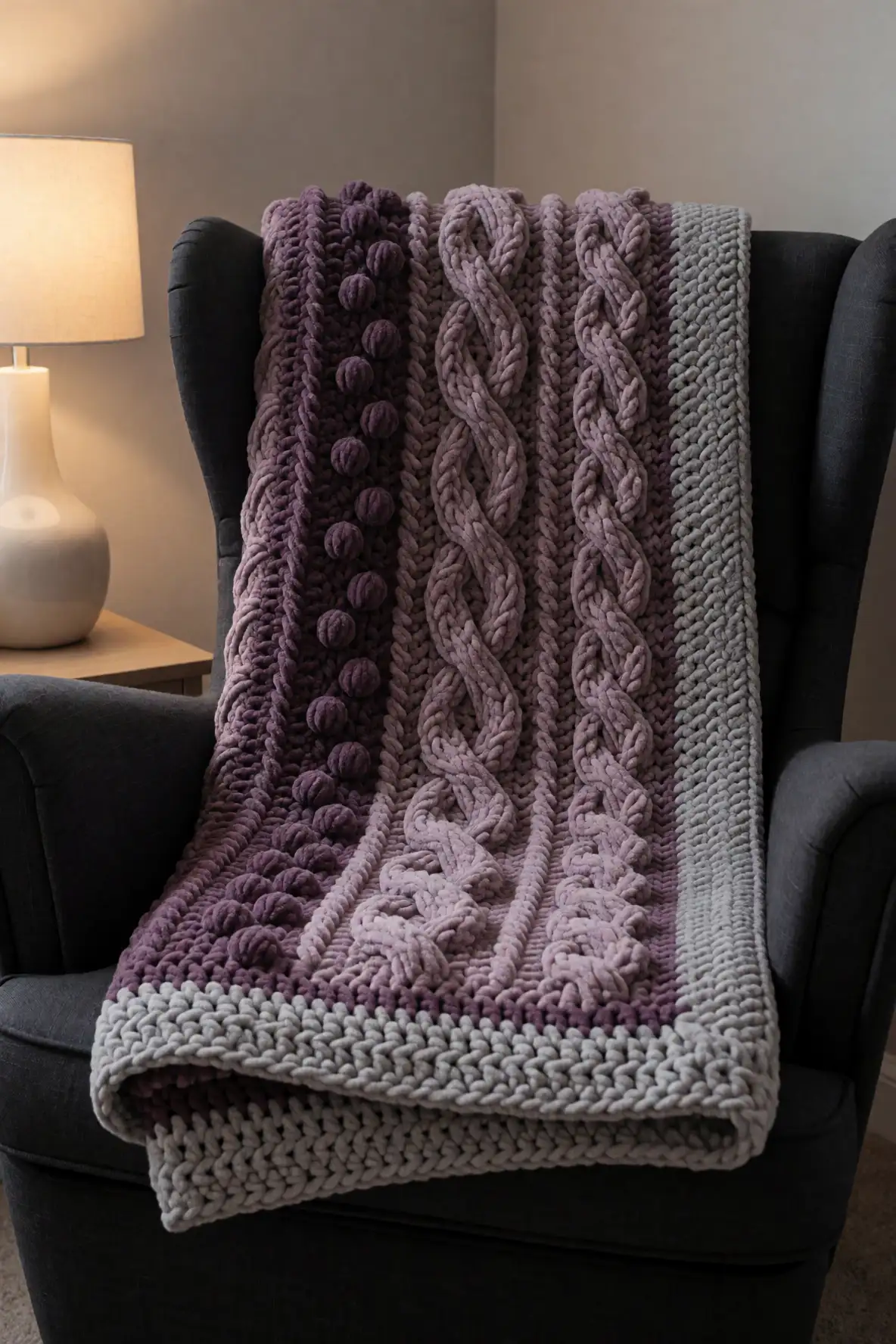
Mauve plum and heather grey create a moody yet soft crochet blanket palette that feels stylish and comforting. Mauve plum adds richness without becoming too dark, while heather grey brings softness and versatility. This combination is ideal for textured blankets because it gives raised stitches a shadowed, plush look that feels especially cozy in bedrooms and evening living spaces.
Try this pairing with cable textures, bobble rows, dense ribbing, or oversized stitches. Heather grey can tone down the plum and make the blanket easier to style with neutral decor. Place it on a charcoal sofa, white bedding, or a reading chair with a soft lamp nearby, and the palette instantly feels warm, calm, and beautifully layered.
Moss Green with Honey Beige
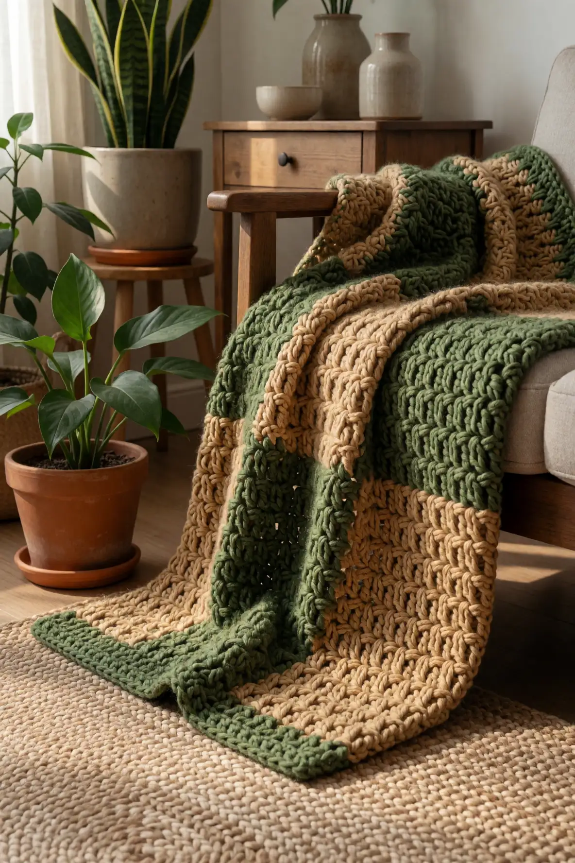
Moss green with honey beige gives a crochet blanket a forest-inspired warmth that feels natural and deeply cozy. Moss green adds an earthy softness, while honey beige brings warmth and brightness. This palette is especially flattering for textured crochet because the colors feel organic, allowing the stitches to look tactile, grounded, and inviting.
Use moss green in large sections for a calming base, then add honey beige along borders or raised stitch patterns for warmth. This combination pairs beautifully with plants, wood furniture, woven rugs, stoneware, and linen cushions. It is a lovely choice for slow living spaces, cabin moods, and cozy corners that need a little color while staying peaceful.
Powder Blue and Warm Camel
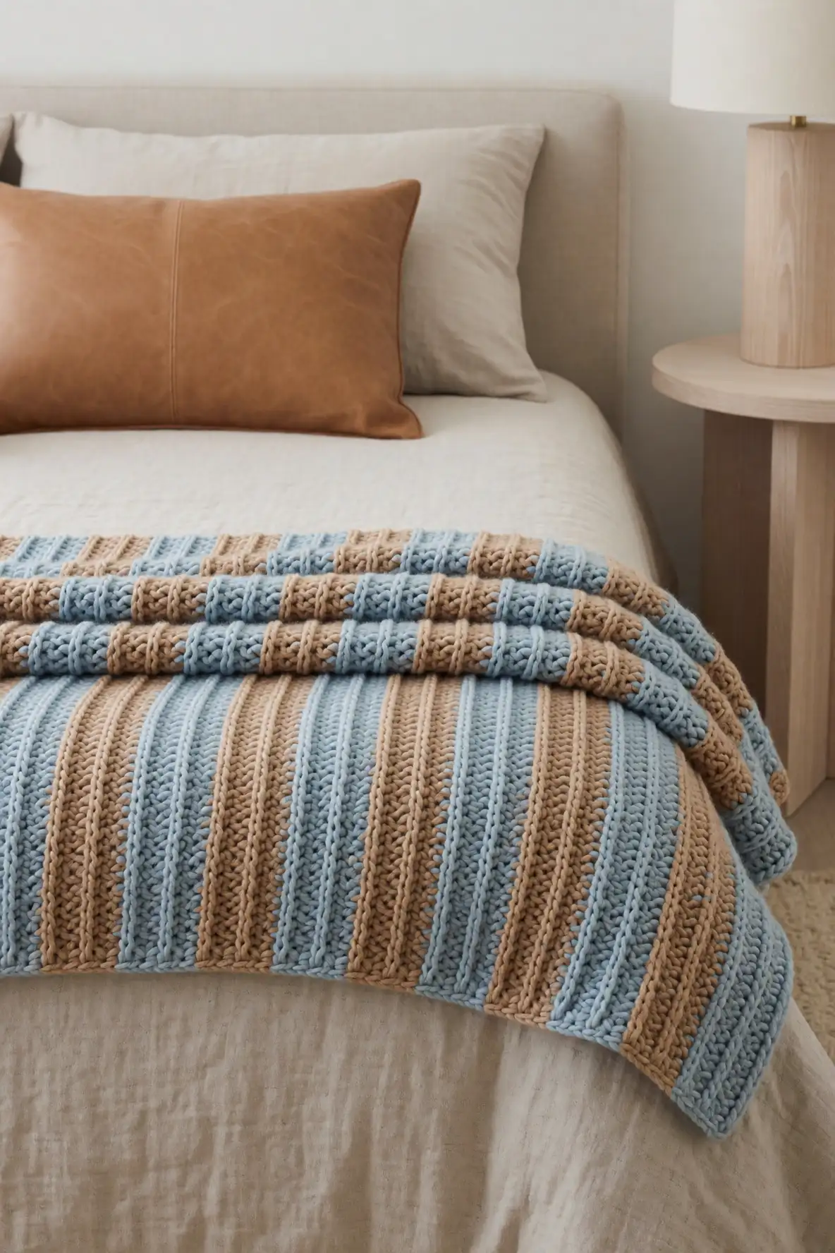
Powder blue and warm camel create an unexpected crochet blanket palette that feels soft, modern, and cozy. Powder blue adds cool freshness, while warm camel brings a grounded neutral richness. The contrast is gentle but interesting, making it a beautiful choice for textured blankets that need a fresh look without moving into overly bright color territory.
This pairing works well in modern bedrooms, neutral living rooms, and handmade gift projects with a refined feel. Powder blue can brighten the design, while camel adds warmth through borders, blocks, or stripe details. Styled with cream sheets, tan leather, pale wood, or woven baskets, the blanket feels calm, elevated, and easy to love.
Mixed Neutrals with Gentle Contrast
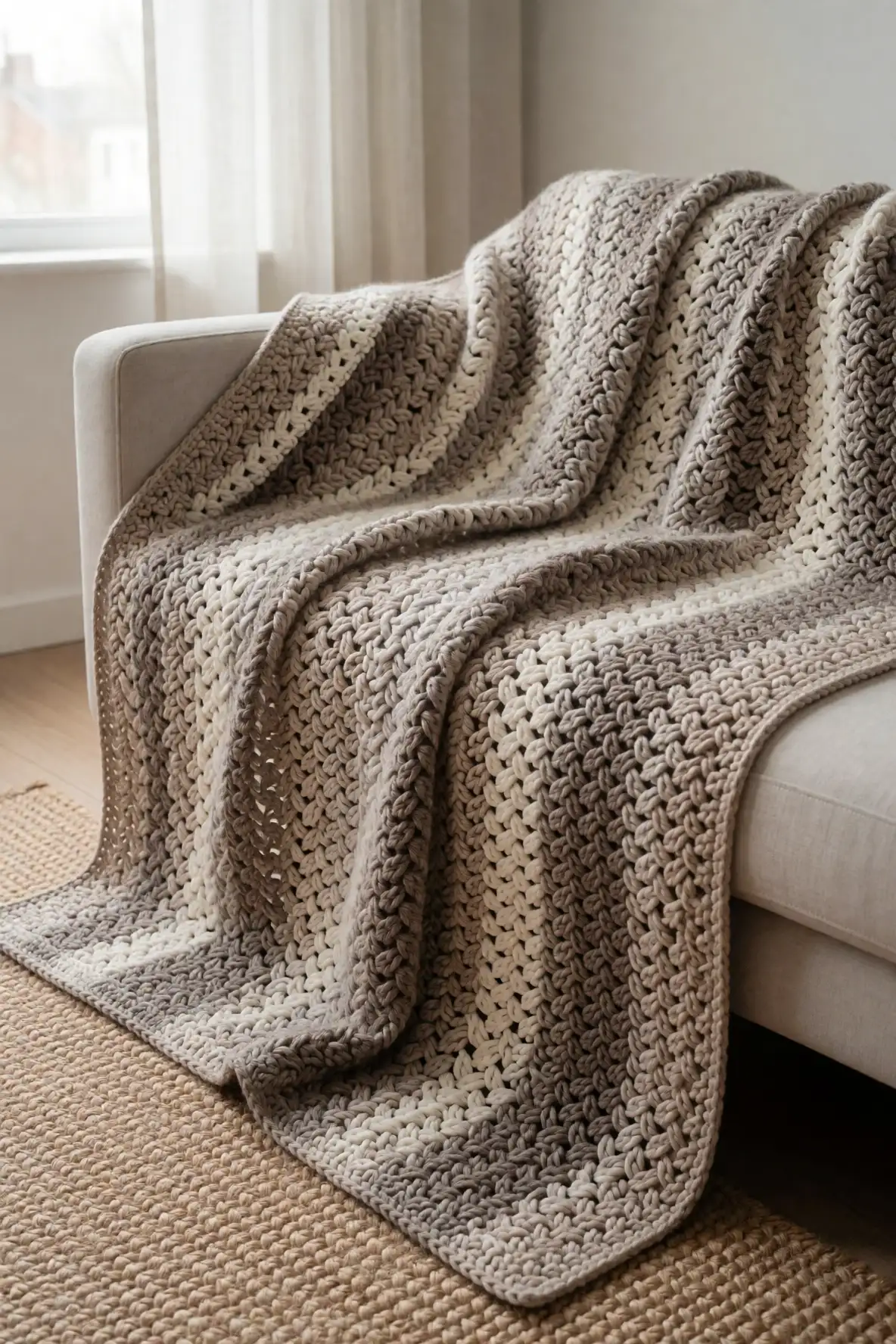
Mixed neutrals with gentle contrast are perfect for crochet blankets when you want texture to be the main feature. Think soft cream, warm beige, pale taupe, greige, and muted brown working together in a calm palette. These shades allow bobbles, cables, ridges, and layered stitches to stand out without overwhelming the room or competing with existing decor.
The key is choosing neutrals with similar warmth so the blanket feels intentional rather than mismatched. Use subtle shifts in shade to create depth across panels, stripes, or stitch sections. This approach is ideal for minimal homes, cozy bedrooms, handmade gifts, and living rooms that already use natural materials. The finished blanket feels soft, versatile, and beautifully timeless.
The best crochet textured blanket color combos feel personal, cozy, and easy to live with. Whether you love creamy neutrals, earthy greens, romantic muted tones, or soft contrast, choosing colors that support the stitch texture will make every handmade blanket feel more thoughtful, stylish, and comforting.