
Bring a warm, welcoming autumn feel to your home with pumpkin-inspired colors that go beyond classic orange. These cozy fall palette ideas pair pumpkin shades with soft neutrals, earthy greens, rich berry tones, and unexpected accents. Try them in a mantel display, a welcoming entryway, a dining centerpiece, or a quiet reading nook for seasonal style that feels comfortable and easy to make your own.
Burnt Orange and Cream Pumpkin Mantel
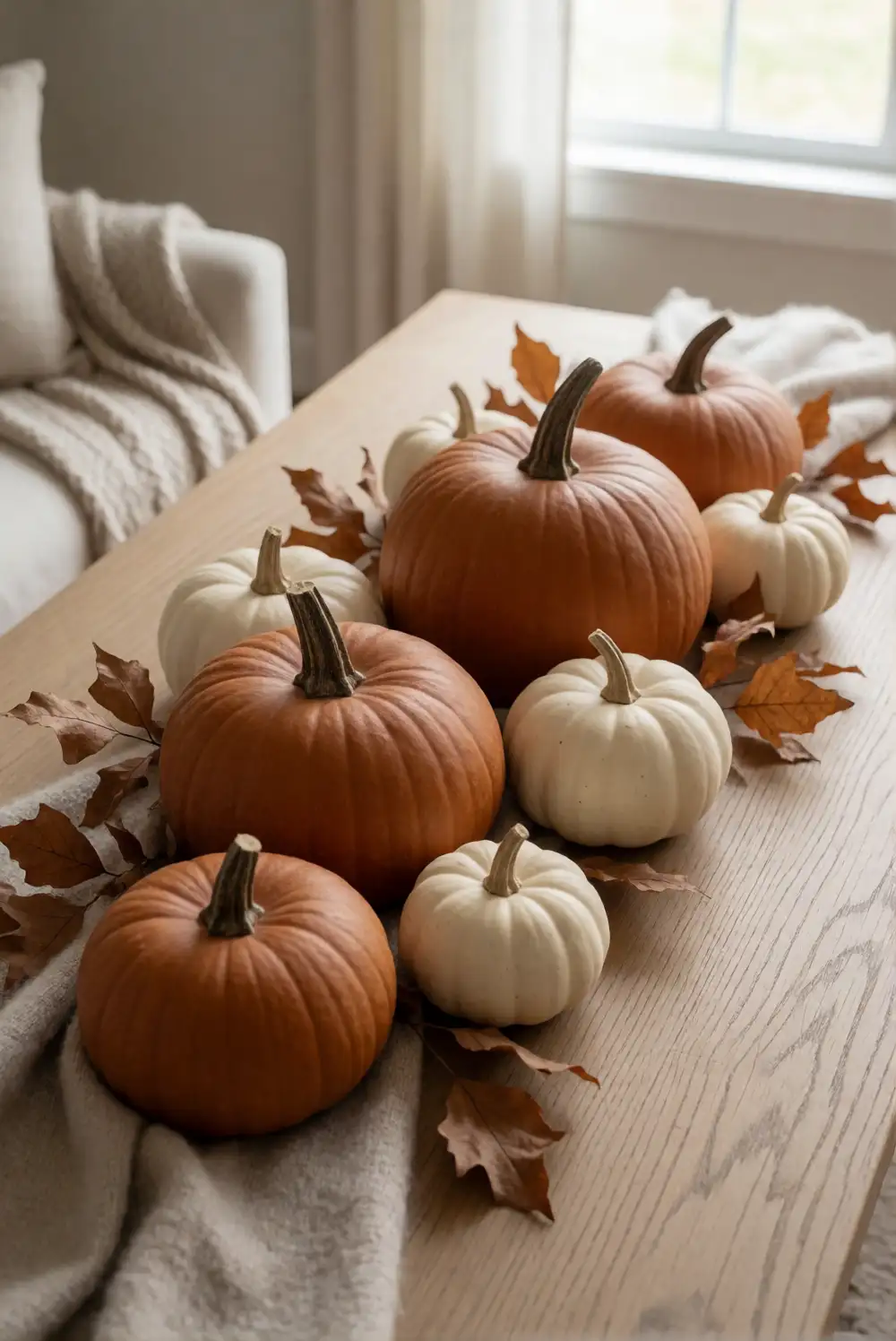
Style a mantel with small burnt-orange pumpkins, cream ceramic gourds, and a loose arrangement of dried leaves. Begin with the largest pumpkins near the ends, then tuck smaller gourds between them to create a gentle rhythm across the shelf. Add a folded cream throw over the edge or place a simple neutral vase nearby. Keep the materials varied, combining matte ceramic, real pumpkins, and soft fabric so the display feels layered without becoming crowded.
For a calmer look, leave open space around the arrangement and limit extra accents to natural branches or a low wooden bowl. A few deeper rust tones can add richness, while pale ivory keeps the palette from feeling heavy. Choose flameless lighting if you want a gentle evening glow, and keep it away from dried foliage. This color pairing also works on a console table, where the pumpkins can sit alongside a small stack of unmarked books.
Sage Green and Ivory Entryway Tray
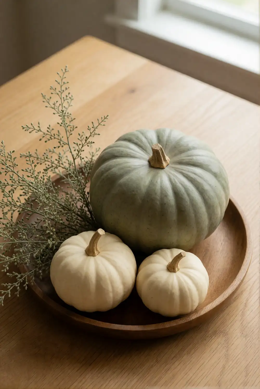
Make a seasonal entryway accent by arranging a sage-green pumpkin, a few ivory gourds, and a shallow wooden tray on a console or bench. Place the largest piece toward the back and group the smaller shapes in front, leaving room for everyday keys or a small dish. Add a sprig of eucalyptus or dried greenery to connect the cool green with the warm wood. The contained tray makes the display easy to move when the entryway needs clearing.
Choose pumpkins with softly different finishes, such as painted wood, matte ceramic, and natural squash, to add interest without introducing more colors. A woven basket beneath the console can echo the organic textures and keep the scene feeling relaxed. If the area is narrow, use a low arrangement that does not obstruct the walkway. Repeat the sage shade in a nearby cushion or small vase to make the seasonal accent feel connected to the rest of the room.
Dusty Blue and Warm Wood Pumpkin Shelf
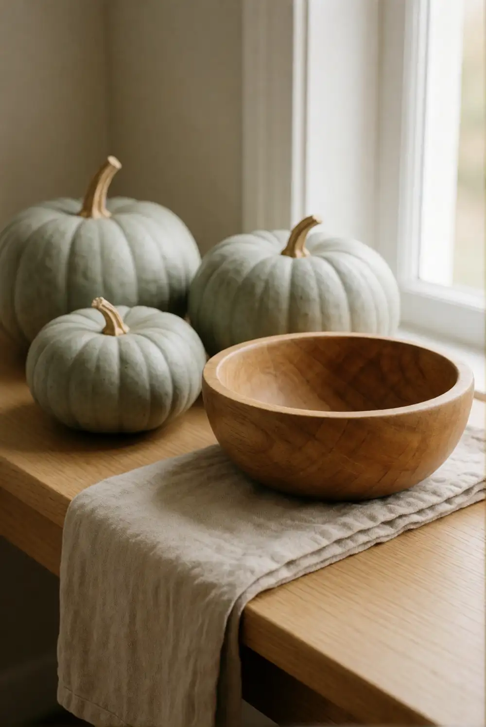
Give a shelf an unexpected autumn update with dusty-blue pumpkins, warm wooden accents, and a few creamy neutral objects. Place a larger blue pumpkin beside a small wooden bowl, then balance the grouping with a second pumpkin in a paler shade. A folded linen cloth can soften the shelf and link the cool blue to the natural wood. Keep the arrangement simple, using different shapes and textures rather than adding many small decorative pieces.
This palette suits rooms where orange feels too bold, while still bringing a seasonal note through pumpkin silhouettes and tactile materials. Mix blue-gray with honey-toned wood for a gentle contrast, or choose pale oak for a quieter effect. Leave some shelf space open so each object remains visible. The same grouping can be moved to a side table or bookcase, and a nearby neutral cushion will help the colors feel intentional throughout the room.
Burgundy and Blush Table Centerpiece
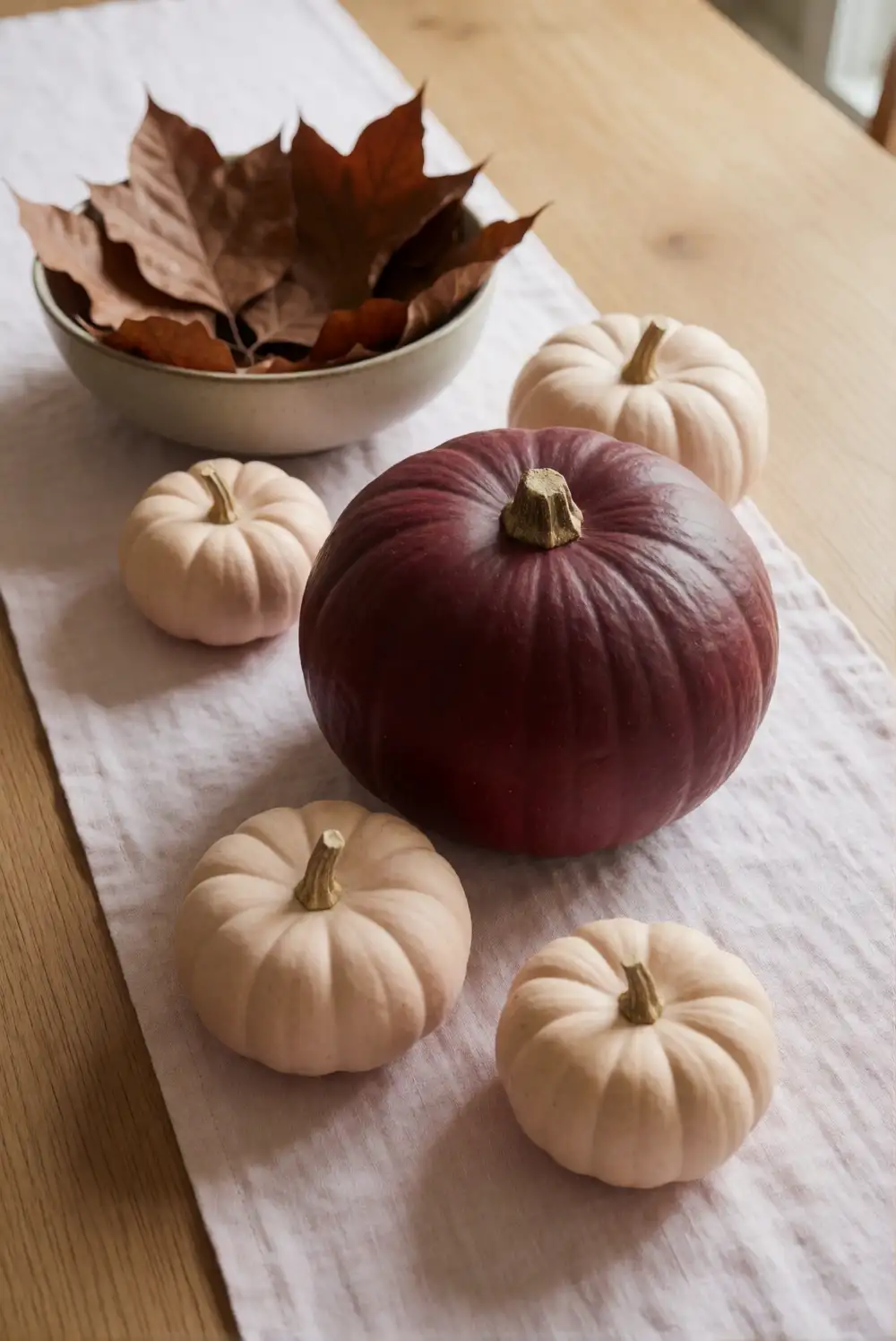
Create a soft, romantic centerpiece with a burgundy pumpkin, blush-colored mini pumpkins, and a low ceramic bowl filled with dried leaves. Set the bowl in the middle of the table and arrange the pumpkins around it, keeping the tallest items low enough for easy conversation across the table. A pale linen runner adds a quiet base, while a few natural branches bring movement. Use pieces with different finishes, such as velvet, ceramic, or painted wood.
Balance the deeper burgundy with plenty of blush and cream so the table feels warm rather than formal. For a longer dining surface, repeat the colors in small clusters instead of building one tall arrangement. Keep the centerpiece clear of serving space, and choose washable fabric if the table is used daily. When the season changes, the blush pieces can stay out with neutral decor while the richer burgundy pumpkin returns to a shelf or mantel.
Mustard Yellow and Charcoal Reading Nook
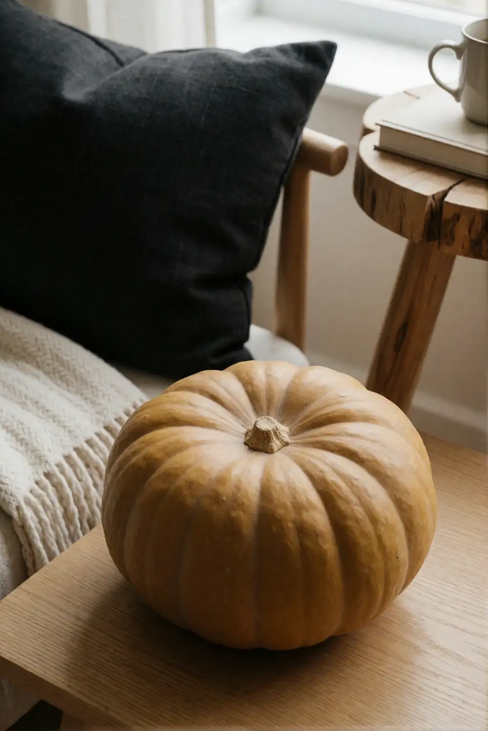
Warm up a reading nook with a mustard-yellow pumpkin on a side table, a charcoal cushion, and a soft cream throw. Set the pumpkin beside a plain ceramic mug or a small woven basket, keeping the tabletop useful for a book and a drink. Add a textured blanket over the chair to connect the yellow accent with the darker charcoal. This arrangement brings autumn color into a small corner without requiring a full room makeover.
Choose a muted mustard rather than a bright lemon shade to keep the nook restful, and use charcoal sparingly so it grounds the palette without darkening the space. A natural wood table helps soften the contrast, while a warm lamp or window light makes the textures more noticeable. If the chair already has a patterned cushion, keep the pumpkin and throw solid. Move the accent pumpkin to a shelf when you want the side table completely clear.
Terracotta and Soft Pink Porch Display
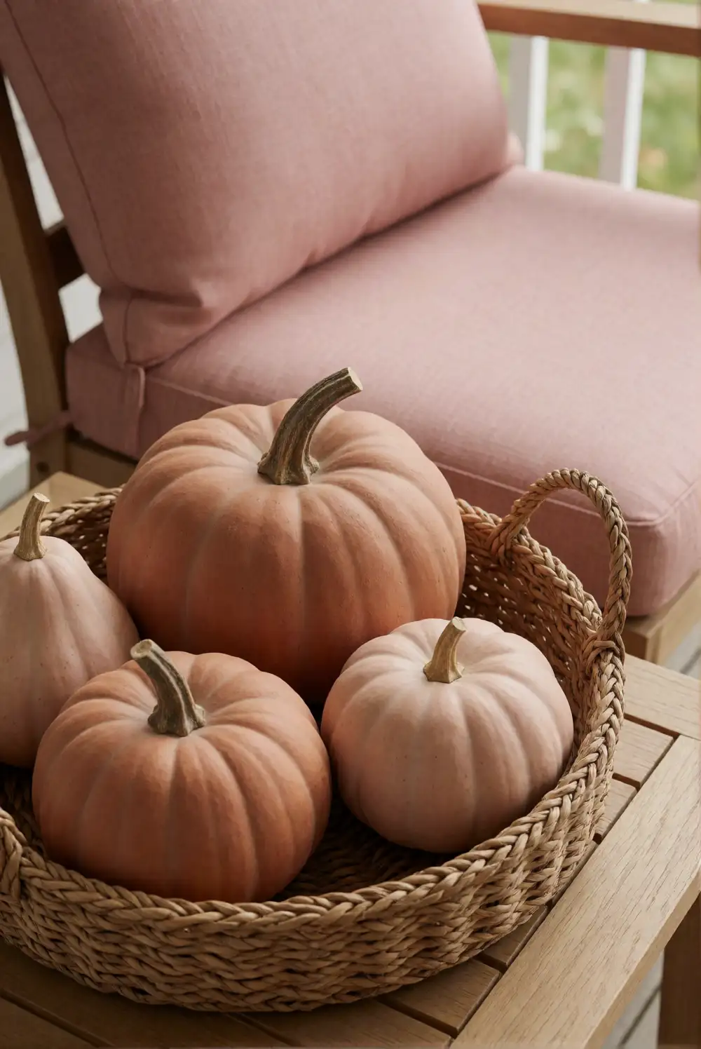
Arrange a welcoming porch display with terracotta pumpkins, soft-pink gourds, and a sturdy woven basket. Place the basket beside the doorway and fill it with a mix of pumpkins, setting the largest at the back and the smallest near the front. A plain outdoor cushion in a muted pink can echo the lighter tones without competing with the display. Choose weather-resistant decorative pieces if the porch is exposed, and keep the arrangement clear of the door swing and walking path.
Terracotta adds earthy depth, while soft pink gives the seasonal grouping a lighter, less traditional feel. A natural coir mat and a simple planter can tie the display to the home’s exterior without adding another strong color. For a covered porch, use fabric pumpkins or painted wooden pieces that can be brought indoors during wet weather. Repeat the terracotta shade in a pot or cushion detail to make the arrangement feel connected rather than isolated.
Olive Green and Natural Linen Dining Corner
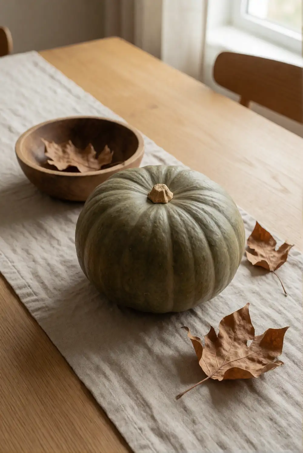
Bring a quiet autumn palette to a dining corner with an olive-green pumpkin, a natural linen runner, and a low wooden bowl. Set the runner along the center of the table, then place the pumpkin beside the bowl with a few dried leaves gathered loosely inside. A simple linen napkin on each place setting can repeat the soft texture without adding visual clutter. This small arrangement works especially well on a compact table where a tall centerpiece would feel imposing.
Choose olive with a slightly muted finish so it sits comfortably beside warm wood and undyed fabric. Add a cream ceramic dish or pale serving bowl for contrast, but avoid stacking too many decorative objects where meals are served. If you want a touch of brighter pumpkin color, tuck in a small amber squash and keep the rest of the setting neutral. The pumpkin and bowl can later move to a kitchen counter while the runner remains useful year-round.
Muted Plum and Cream Bedroom Styling
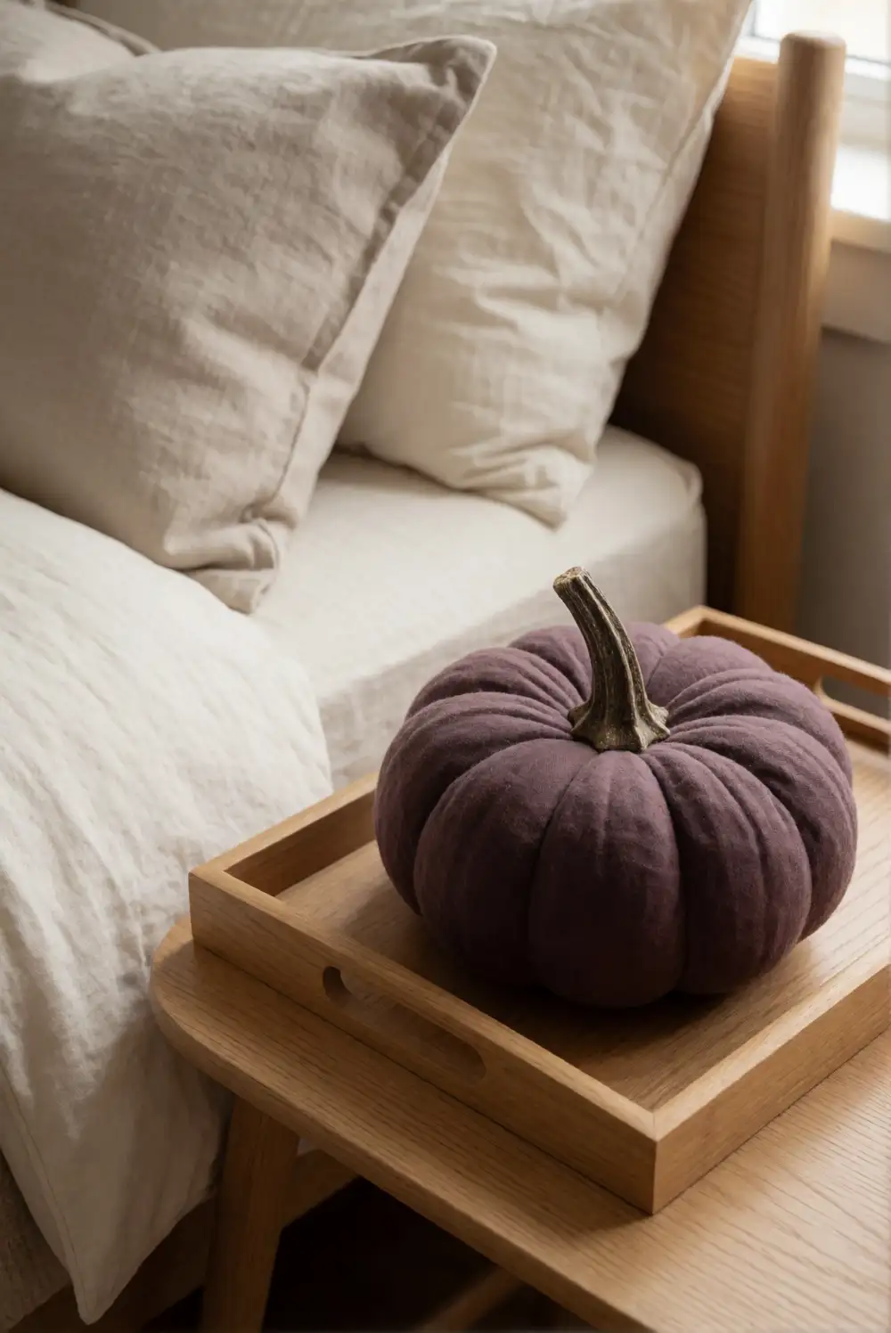
Introduce autumn color to a bedroom with a muted-plum pumpkin on a bedside table, a cream quilt, and a soft neutral pillow. Set the pumpkin on a small tray so it feels contained beside the lamp and other daily essentials. A folded throw at the foot of the bed can repeat the plum shade in a subtle way, while cream bedding keeps the room light. Choose a small decorative pumpkin with a smooth finish for a restful, uncluttered effect.
Keep the palette gentle by pairing plum with ivory, oatmeal, and natural wood rather than adding several saturated colors. A fabric pumpkin is a practical choice for a bedside surface because it has a soft texture and is easy to move. If the room already has colorful bedding, use the pumpkin as the sole seasonal accent and let the existing colors lead. After fall, replace it with a neutral ceramic object and keep the cozy textiles in place.
Copper and Oatmeal Kitchen Counter Vignette
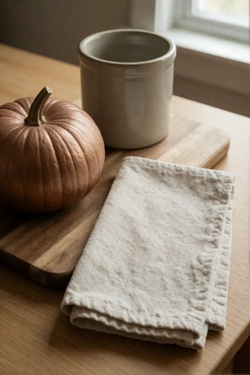
Style a kitchen counter with a small copper-toned pumpkin, an oatmeal-colored tea towel, and a wooden cutting board leaned against the backsplash. Place the pumpkin on a low tray beside a bowl of seasonal produce, keeping the arrangement away from the main food-preparation area. A plain ceramic crock can hold cooking utensils nearby, helping the vignette blend with useful kitchen objects. Use a washable towel and a tray with a smooth surface for easy everyday cleanup.
The copper shade brings warmth, while oatmeal fabric and natural wood keep the counter from feeling overly decorated. If your kitchen has cool-toned surfaces, add a cream bowl to bridge the palette. Keep the display compact and avoid placing decor near heat, water, or sharp tools. When you need more workspace, move the tray to a breakfast nook or open shelf. A small pumpkin and soft towel can still signal the season without taking over the kitchen.
Classic Orange and Deep Brown Fireside Basket
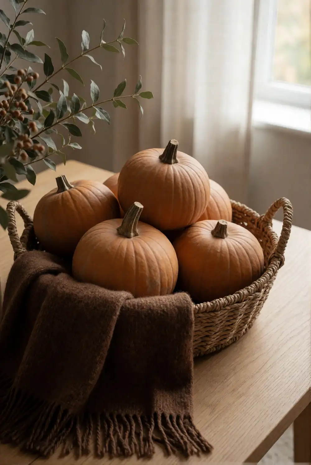
Fill a wide woven basket with classic orange pumpkins, a deep-brown folded throw, and a few pieces of natural foliage for a cozy fireside accent. Nestle the throw into the basket first, then arrange the pumpkins on top so their color stands out against the darker fabric. Keep the basket beside the hearth but well clear of heat and any open flame. A sturdy basket with a low profile makes the display easy to relocate when the room needs more floor space.
Choose a deep chocolate or walnut brown that complements the orange without making the grouping look too heavy. Add cream-colored foliage or a pale cushion nearby to lift the darker tones. For a simpler version, use just the basket, throw, and a single statement pumpkin. Make sure decorative foliage and fabric stay away from heat sources, and use a flameless light if you want a gentle glow. This arrangement also works beside a sofa or reading chair.
Whether you prefer classic orange or a softer mix of sage, blush, plum, and cream, pumpkin-inspired colors can make fall decor feel personal and inviting. Start with a small display on a mantel, table, or entryway tray, then repeat a favorite shade elsewhere through a cushion, throw, or ceramic accent. Natural textures and thoughtfully chosen color pairings help each seasonal arrangement feel cozy without overwhelming your home.