
Choosing the right color for a textured blanket can completely shift the feeling of a room. From soft neutrals to earthy accents and moodier statement shades, the most inviting palettes feel calm, tactile, and easy to layer with the pieces you already love.
Warm Oatmeal for Everyday Calm
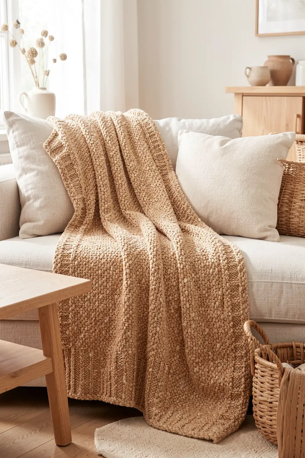
Warm oatmeal is the kind of textured blanket color that instantly makes a room feel softer without demanding attention. It sits beautifully between beige, cream, and pale tan, creating a relaxed foundation that works with wood tones, linen upholstery, woven baskets, and quiet ceramic accents. On chunky knits, waffle weaves, bouclé, and brushed cotton, oatmeal adds dimension while keeping the overall palette serene, natural, and easy to live with.
This shade is especially useful when you want a blanket that can move from sofa to bed to reading chair without clashing with seasonal decor. Pair it with creamy pillows for a gentle tonal look, or place it against deeper browns and charcoal accents for subtle contrast. Oatmeal also photographs beautifully in natural light, making it a favorite for cozy, minimal interiors that still feel warm and approachable.
Creamy Ivory for Soft Minimal Rooms
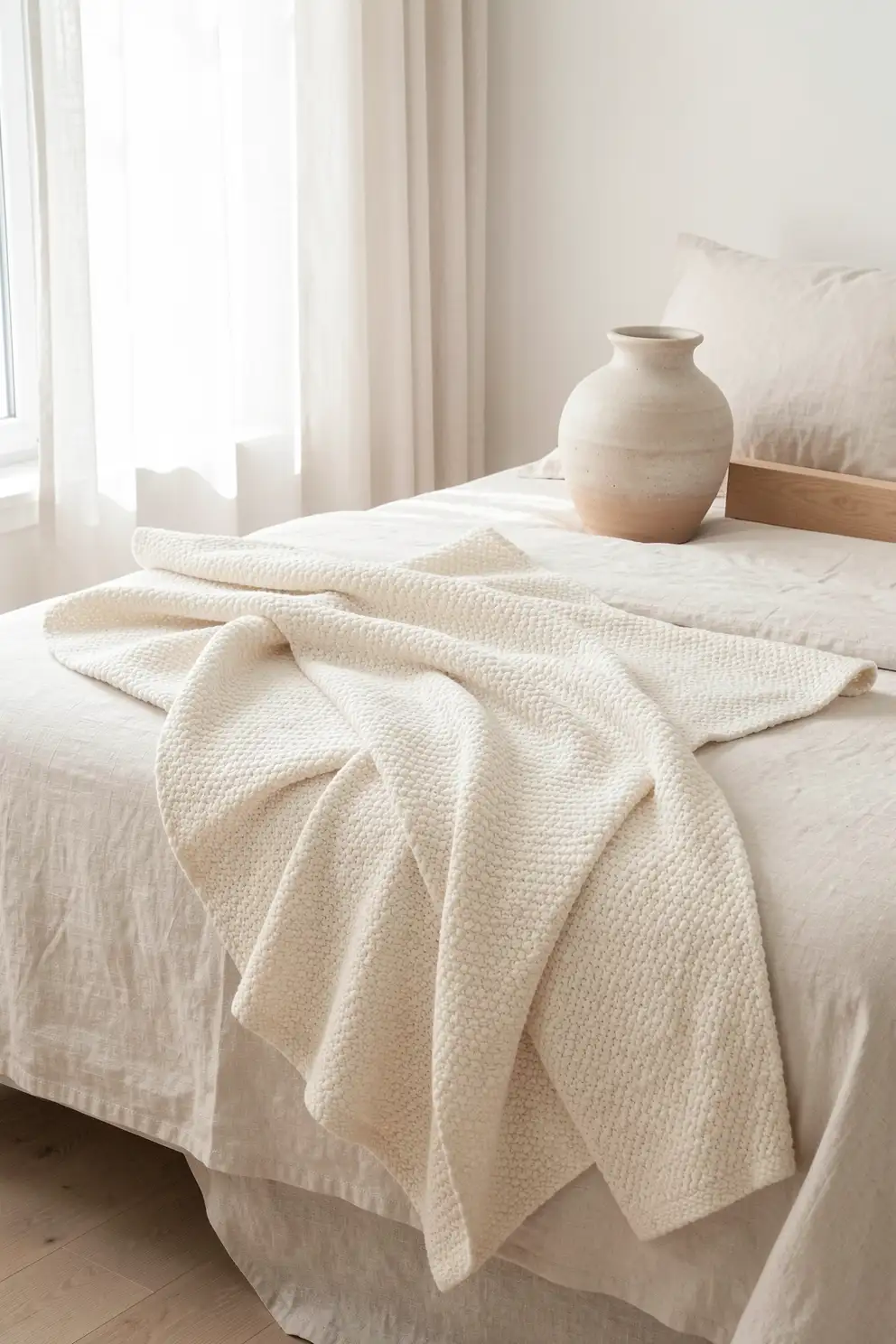
Creamy ivory brings a clean, airy feeling to a textured blanket while avoiding the starkness of bright white. It makes raised stitching, ribbed lines, fringe, and plush pile stand out in a refined way, so the blanket feels decorative even when the color is simple. In soft minimal rooms, ivory adds freshness to beige walls, pale woods, slipcovered furniture, and cloudy bedding without making the space feel cold.
The key to styling ivory is surrounding it with tactile contrast. Let it rest over a linen duvet, a nubby accent chair, or a smooth leather sofa so the texture becomes the focus. Ivory also works beautifully with clear glass, light stone, warm metals, and dried florals. It gives a room a quiet sense of polish, making everyday lounging corners look intentional, peaceful, and effortlessly pulled together.
Clay Beige for Natural Warmth
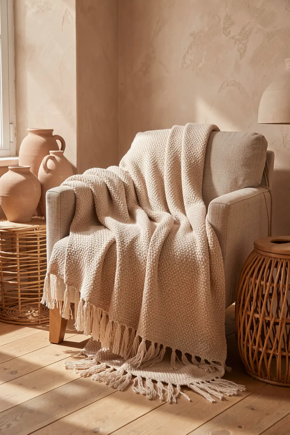
Clay beige has a slightly sun warmed quality that feels more grounded than standard beige. It hints at terracotta, sand, and natural plaster, making it a gorgeous choice for textured blankets in earthy interiors. This color looks especially rich on woven cotton, slub yarn, and thick knitted throws because the warm undertone catches light in a soft, organic way. It feels casual, relaxed, and quietly sophisticated.
Use clay beige when a room needs more warmth but not more visual noise. It pairs naturally with rattan, walnut, jute rugs, cream curtains, and handmade pottery. For a layered bed, fold it across the foot with off white sheets and taupe cushions. On a sofa, it can soften structured silhouettes and bring a more relaxed, lived in feeling to a neutral space.
Mushroom Taupe for Quiet Luxury
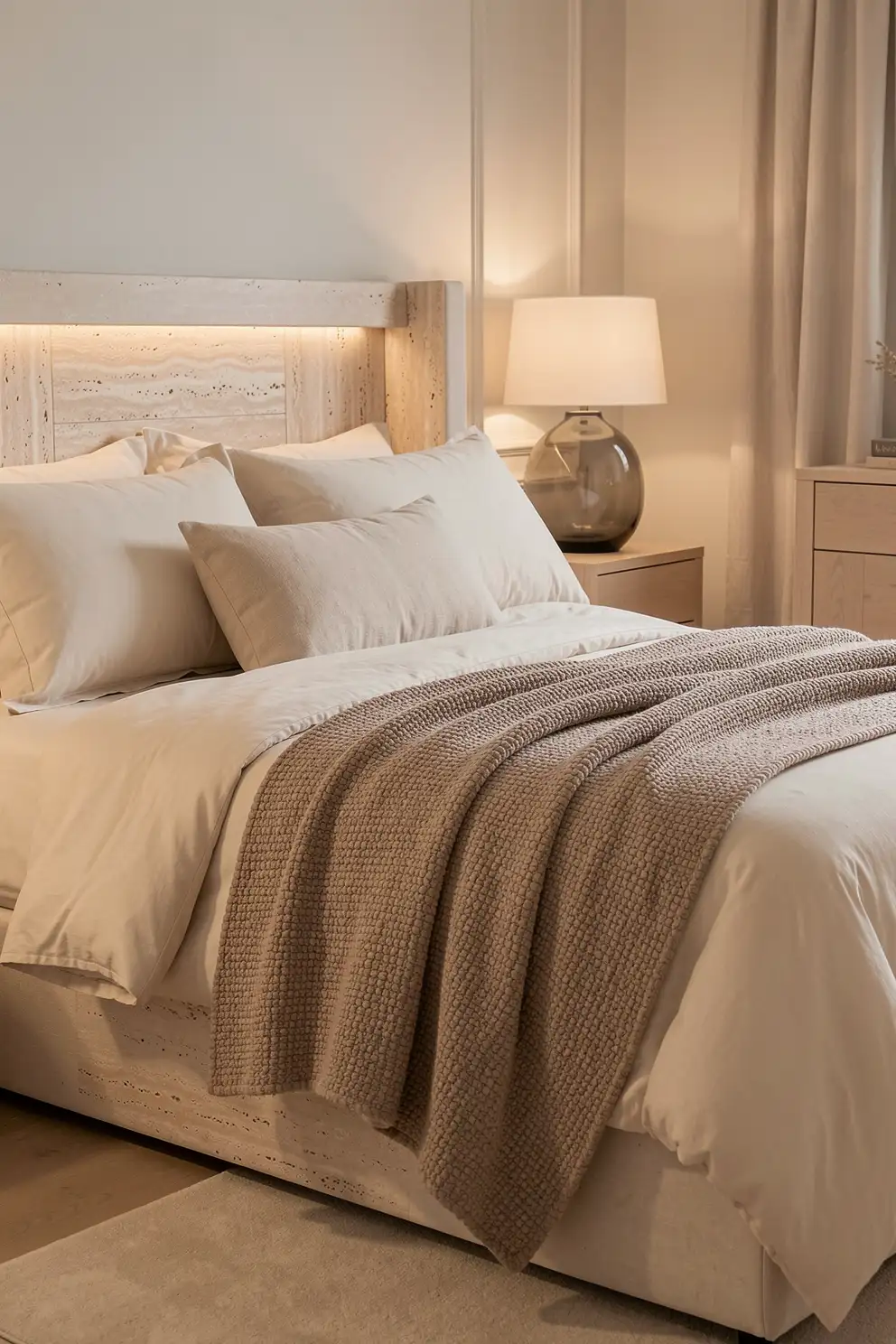
Mushroom taupe is a refined neutral with a cool, earthy undertone that makes textured blankets feel elevated. It is softer than gray, calmer than brown, and more interesting than beige, which gives it a quietly luxurious presence. On bouclé, ribbed fleece, brushed wool, or matelassé textures, mushroom taupe creates shadows and highlights that look layered without appearing busy or overly styled.
This color works beautifully in rooms with stone, travertine, black accents, pale oak, or creamy upholstery. It can make a bed feel hotel inspired while still feeling personal and cozy. Try it with ivory pillows, smoky glass lamps, or warm brass details for a balanced palette. Mushroom taupe is ideal when you want a blanket that feels grown up, understated, and timeless.
Cocoa Brown for Cocooning Comfort
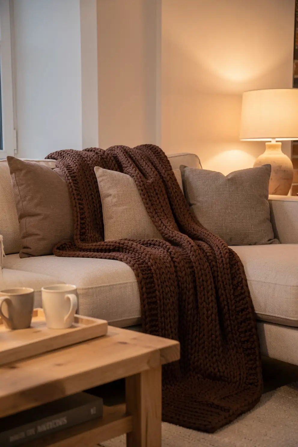
Cocoa brown is deeply comforting, especially when used on a blanket with visible texture. It evokes hot drinks, soft leather, dark wood, and cozy evenings, making it perfect for rooms that need more depth. Unlike black, cocoa feels warm and enveloping, while still grounding lighter palettes. A chunky cocoa throw across a pale sofa can instantly make the seating area feel richer and more inviting.
This shade pairs well with oatmeal, cream, camel, rust, olive, and muted gold. It also works beautifully in bedrooms where you want a restful, cocoon like feeling without using overly dark bedding throughout the entire room. Because cocoa brown has a natural warmth, it flatters both traditional and modern spaces. Choose plush textures for a relaxed mood or tighter weaves for a polished finish.
Mocha Gray for Modern Neutral Depth
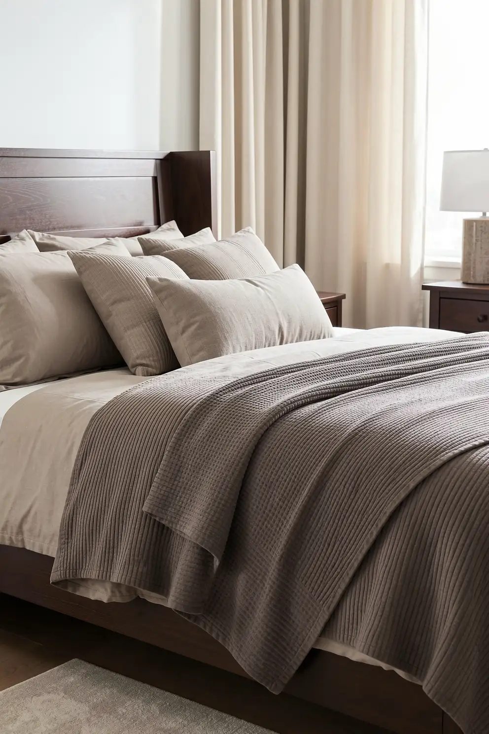
Mocha gray blends the softness of gray with the warmth of coffee toned brown, creating a balanced neutral that feels modern but not chilly. For textured blankets, this shade is especially versatile because it can lean cozy, sleek, or rustic depending on the materials around it. It looks refined on quilted cotton, brushed knits, herringbone weaves, and dense fleece with a subtle heathered finish.
Use mocha gray when a room already has warm wood or beige elements but needs a slightly moodier layer. It pairs effortlessly with cream, espresso, greige, charcoal, and muted sage. On a bed, it adds depth without overwhelming pale bedding. On a sofa, it hides everyday wear better than lighter shades while still feeling soft and carefully chosen rather than purely practical.
Sage Green for Restful Texture
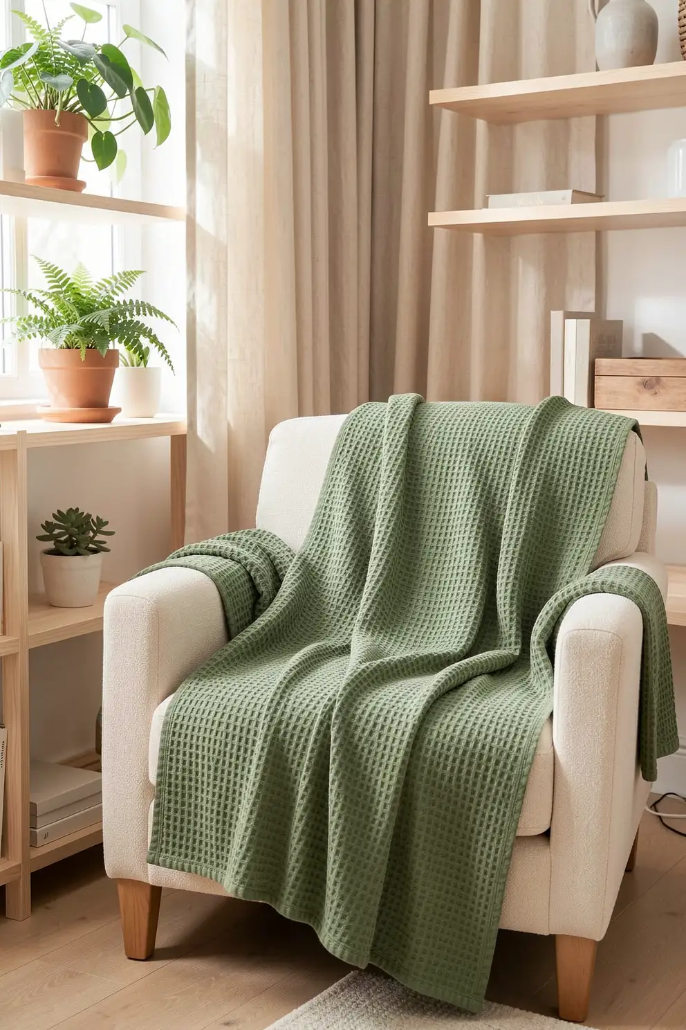
Sage green is a soothing choice for a textured blanket because it brings a gentle hint of nature indoors. It feels calm, muted, and restorative, making it especially beautiful in bedrooms, reading corners, and relaxed living spaces. On waffle, cable knit, gauze, or woven textures, sage has enough color to feel fresh while staying soft enough to layer with neutrals and natural materials.
This shade works well with ivory, oatmeal, pale wood, stone, linen, and warm gray. It can also calm richer accents like rust, cocoa, and deep olive. If your room feels too plain but you do not want a bold statement, sage green offers a subtle color shift that still feels peaceful. It is an easy way to add personality while keeping the overall atmosphere grounded.
Olive Green for Earthy Character
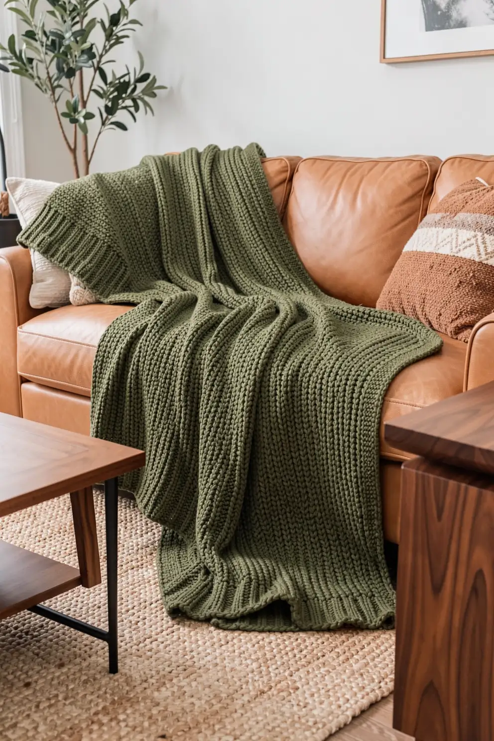
Olive green gives a textured blanket a grounded, earthy character that feels both relaxed and stylish. It has more depth than sage and more softness than forest green, making it a beautiful middle ground for cozy interiors. Olive looks especially rich on heavier knits, brushed wool blends, woven stripes, and soft fleece because the texture brings out subtle variations in the color.
Style olive with warm neutrals, tan leather, walnut wood, black accents, and natural fiber rugs for a collected look. It also pairs beautifully with cream bedding and terracotta accessories for a cozy, organic palette. If you want a blanket color that feels calm but not plain, olive adds quiet personality. It is especially useful in rooms that need a natural anchor.
Dusty Blue for Serene Layers
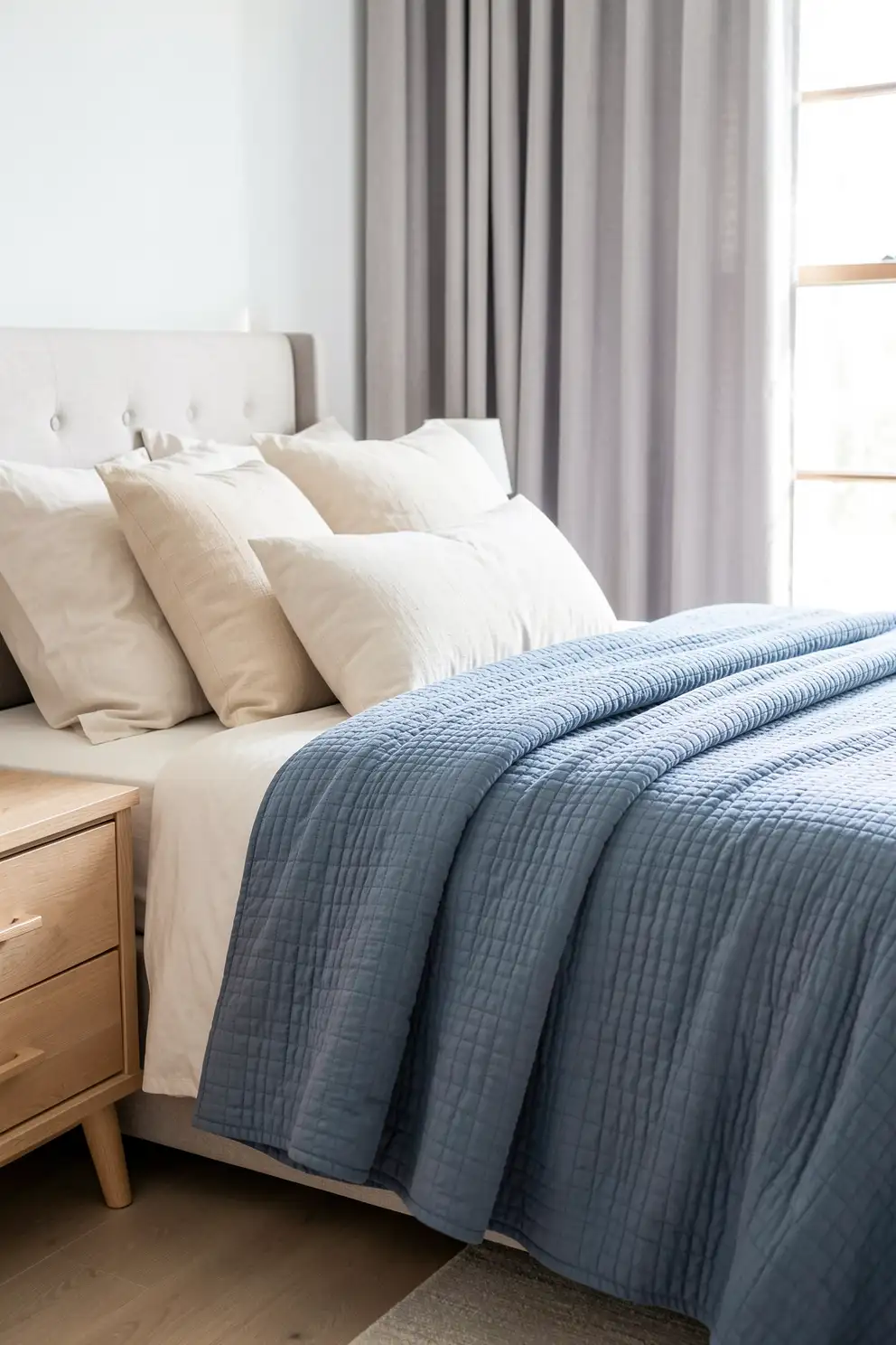
Dusty blue has a soft, faded quality that makes textured blankets feel peaceful and lived in. It brings color into a space without creating sharp contrast, which is why it works so well in bedrooms and calm lounge areas. On quilted textures, cotton knits, and washed linen blends, dusty blue feels relaxed, breathable, and slightly nostalgic in the best way.
This color pairs beautifully with ivory, pale gray, taupe, natural oak, and brushed nickel. For a warmer look, combine it with camel, clay beige, or muted rust. Dusty blue is also a lovely choice for coastal inspired rooms that avoid obvious beach themes. It suggests open air and quiet mornings while still feeling grown up, cozy, and easy to style year round.
Stormy Blue for Moody Coziness
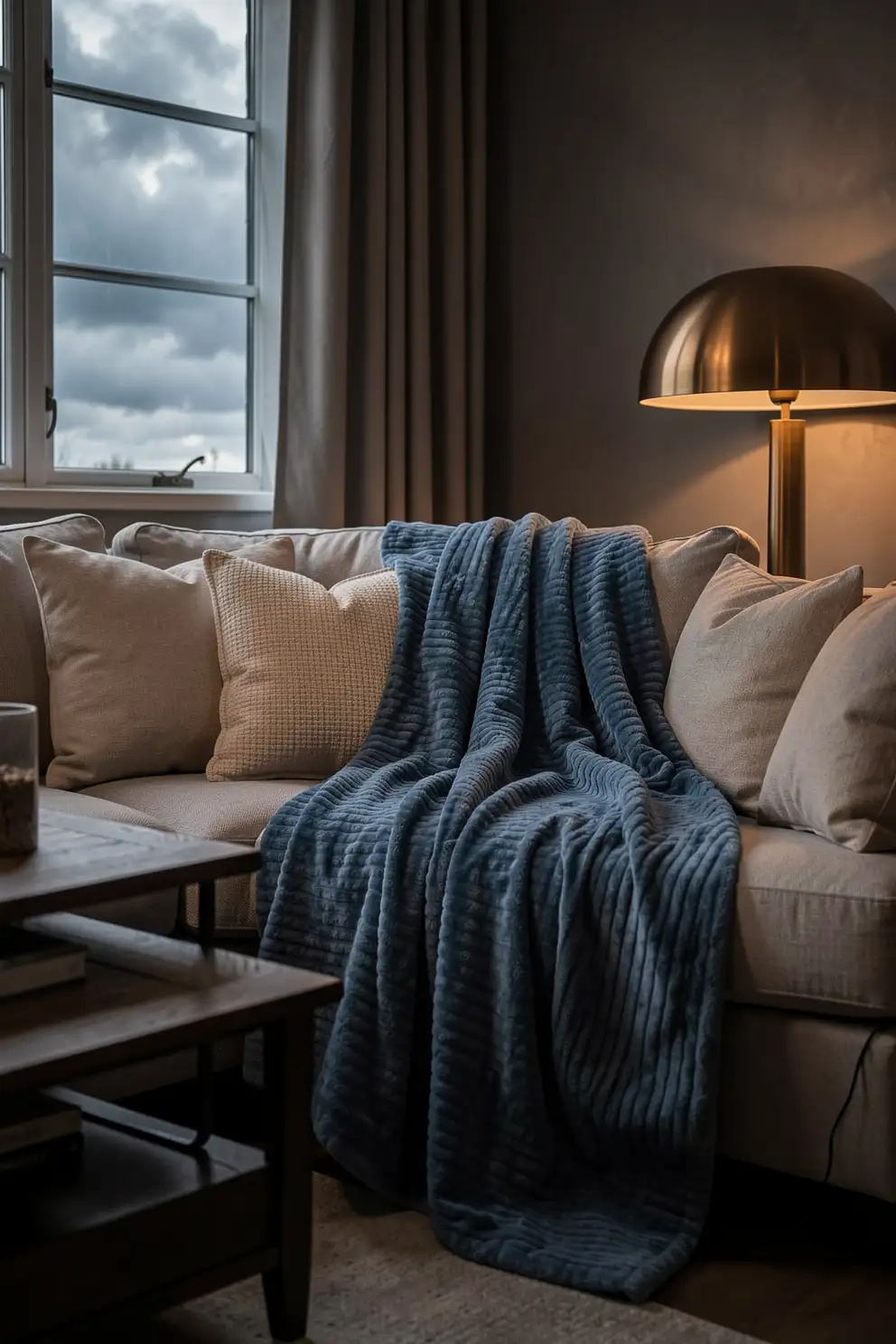
Stormy blue is deeper and moodier than dusty blue, making it a striking option for a textured blanket with a cozy edge. It brings the feeling of cloudy skies, evening light, and quiet indoor moments. On raised weaves, ribbed knits, or plush surfaces, stormy blue creates beautiful shadow and movement, giving the blanket a luxurious, layered presence.
Use stormy blue when you want contrast without choosing black or navy. It looks elegant with cream bedding, warm wood furniture, bronze lamps, and charcoal accents. In a living room, drape it over a neutral sofa to create a grounded focal point. The shade feels calm but substantial, making it ideal for spaces that need softness with a little drama.
Soft Lavender for Dreamy Corners

Soft lavender is a gentle, dreamy color that can make a textured blanket feel unexpectedly refined. Instead of feeling overly sweet, a muted lavender with gray or mauve undertones brings quiet charm to bedrooms, vanity corners, and cozy chairs. Texture keeps the color grounded, especially when the blanket is made from ribbed cotton, plush fleece, or softly brushed yarn.
This shade pairs beautifully with ivory, mushroom taupe, pale gray, blush, and warm wood. It can also soften darker palettes when layered near charcoal or deep plum. Soft lavender is ideal if you want a room to feel romantic, restful, and a little unique without leaning too bold. It works best when surrounded by calm, tactile materials and gentle lighting.
Blush Pink for Gentle Warmth
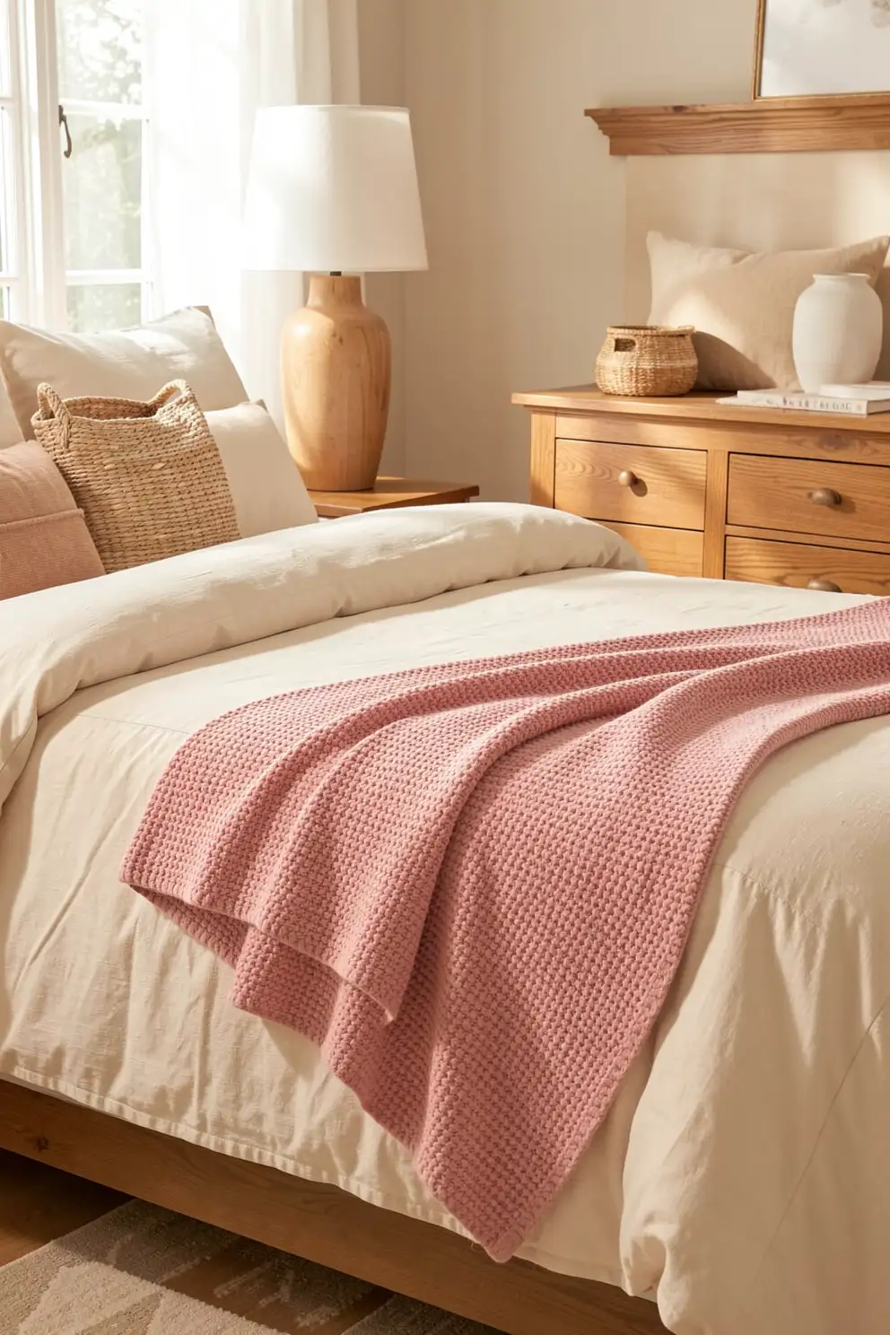
Blush pink adds warmth to a textured blanket in a delicate, flattering way. A muted blush feels more mature than bright pink and blends easily with cream, beige, taupe, and soft gray. On knitted, quilted, or faux fur textures, it creates a gentle glow that makes beds and seating areas feel softer, more welcoming, and quietly romantic.
To keep blush feeling polished, pair it with natural materials and grounded neutrals. Try it beside linen bedding, oak furniture, ceramic lamps, or woven storage baskets. It can also brighten darker shades like cocoa, plum, and charcoal without creating harsh contrast. Blush is a wonderful option when a room needs a touch of warmth, softness, and personality while still feeling calm.
Terracotta for Sun Baked Richness
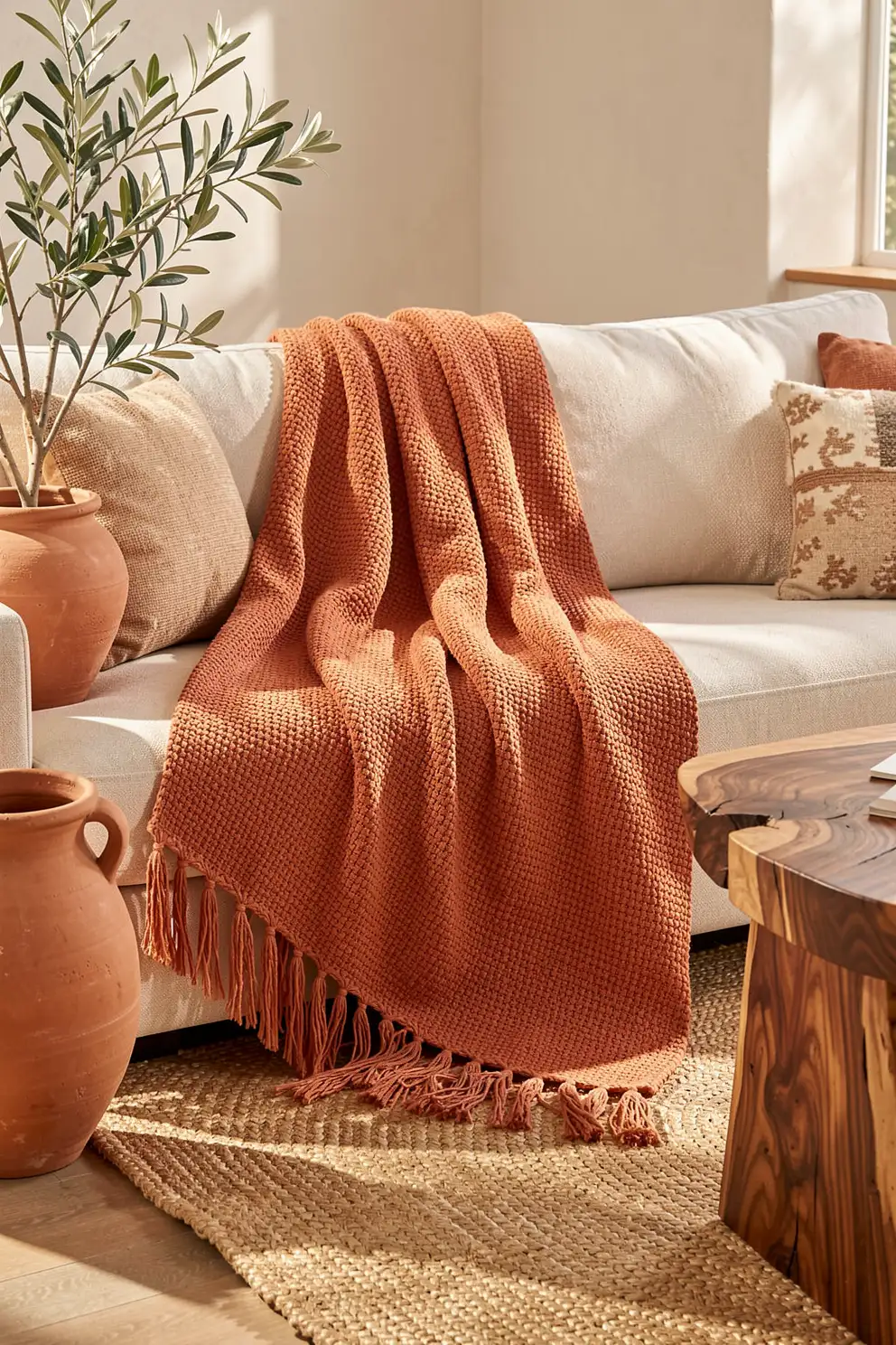
Terracotta brings a warm, sun baked richness to textured blankets, making it ideal for cozy spaces with earthy character. The color feels rooted in clay, desert landscapes, and handmade ceramics, so it pairs naturally with organic textures. On chunky knits, woven cotton, fringe trimmed throws, and softly faded fabrics, terracotta adds personality without feeling loud or overly bright.
This shade looks especially beautiful with cream, sand, olive, walnut, and matte black accents. It can warm up a pale sofa, add depth to neutral bedding, or connect a room filled with plants and natural fibers. Terracotta is perfect when you want a blanket to feel decorative but still relaxed. It brings instant atmosphere and makes simple rooms feel more collected.
Burnt Apricot for Cozy Glow
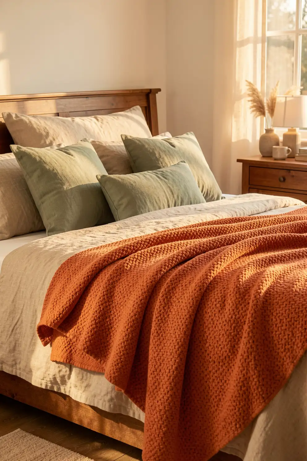
Burnt apricot is softer than orange and lighter than rust, giving textured blankets a warm glow that feels fresh and inviting. It has a cheerful undertone, but when muted, it remains elegant and easy to style. This color works beautifully on soft throws with tactile details because the texture keeps it cozy rather than overly bright.
Pair burnt apricot with cream, oatmeal, walnut, sage, clay beige, or muted rose for a layered palette that feels warm and natural. It is especially lovely in spaces that receive golden afternoon light, where the color can deepen and soften throughout the day. Use it as a seasonal accent or keep it year round in rooms that benefit from warmth and charm.
Deep Plum for Elegant Contrast
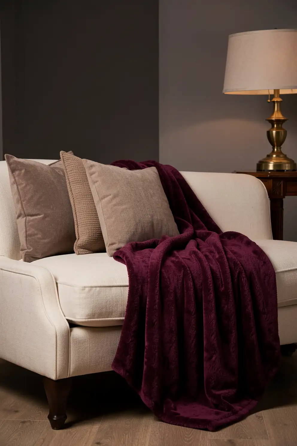
Deep plum gives a textured blanket a rich, elegant quality that feels cozy without being predictable. It has the depth of a jewel tone but becomes more livable when softened with muted undertones. On velvet like plush, chunky knits, and ribbed throws, deep plum catches light beautifully, creating a sense of softness, shadow, and quiet drama.
This color pairs well with ivory, taupe, blush, charcoal, walnut, and antique brass. It can make a bedroom feel more intimate or bring a sophisticated accent to a neutral sofa. Deep plum is a strong choice when you want color that feels grown up, warm, and slightly romantic. Use it sparingly for impact, or layer it with tonal pillows for a moody look.
Charcoal for Graphic Softness
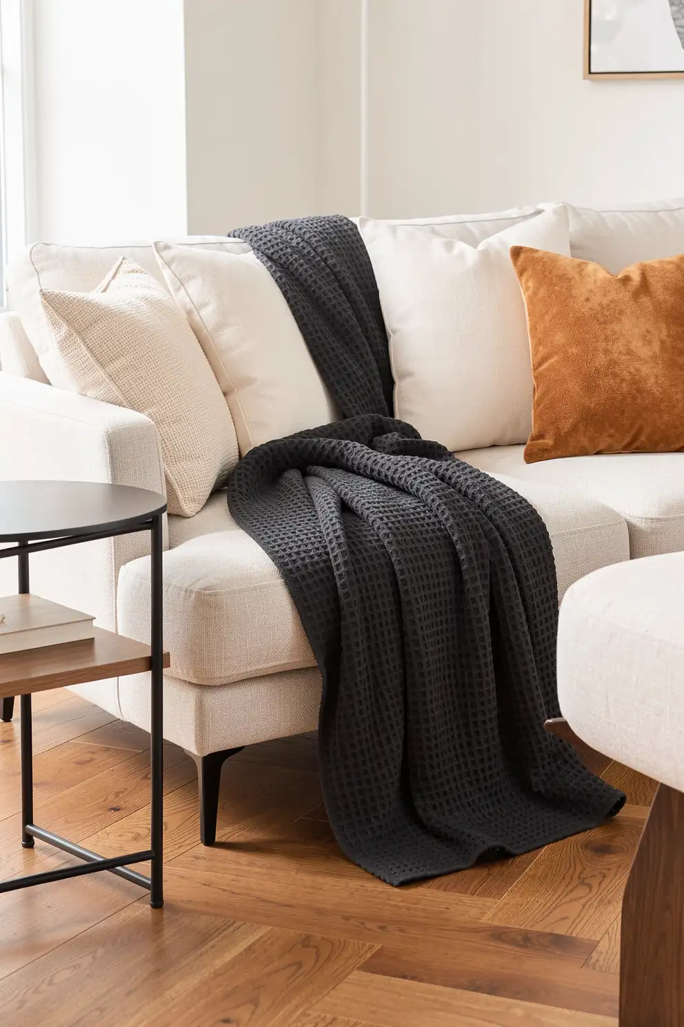
Charcoal is a powerful textured blanket color because it adds definition while still feeling soft and cozy. It works especially well when a room has pale upholstery, light bedding, or warm neutral walls that need contrast. Unlike pure black, charcoal has a slightly softened edge, so it feels modern and grounded without becoming harsh.
Choose charcoal in plush, ribbed, waffle, or woven textures to bring dimension to the dark shade. It pairs beautifully with ivory, oatmeal, camel, mocha gray, and muted green. In minimal rooms, a charcoal throw can create a clean focal point. In cozier spaces, it balances warm woods and layered textiles, giving the room a more intentional, finished look.
Muted Mustard for Vintage Warmth
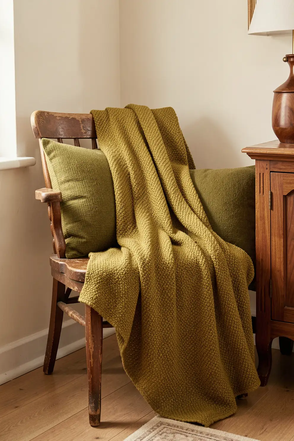
Muted mustard brings vintage warmth to a textured blanket without feeling overly bright. When softened with golden brown or ochre undertones, it adds character and comfort to a room. This color looks beautiful on woven patterns, knit stitches, and soft fringe because the texture enhances its nostalgic charm. It feels cheerful, earthy, and cozy all at once.
Style muted mustard with cream, walnut, olive, cocoa, charcoal, or rust for a rich yet balanced palette. It is especially useful in rooms that feel too neutral and need a warm accent with personality. A mustard throw can make a reading chair feel more inviting or give a simple bed a charming focal point. Keep surrounding decor calm so the color can shine gently.
Layered Neutrals for Effortless Styling
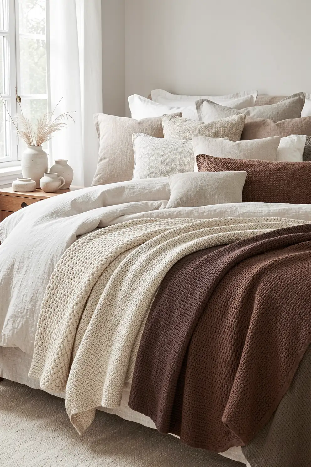
Layered neutrals are always a beautiful approach for textured blankets because they let material, weave, and softness become the main story. Instead of choosing a single standout shade, combine tones like ivory, oatmeal, clay beige, taupe, mocha, and cocoa. The result feels calm and collected, especially when each textile has a different surface quality.
This palette works in nearly any cozy home because it is flexible, timeless, and easy to refresh with small accents. Mix smooth cotton sheets with chunky knits, woven pillows, plush rugs, and matte ceramics to create visual interest. Layered neutrals also allow seasonal colors to come and go naturally. A textured blanket in this family will always feel useful, beautiful, and simple to style.
The best textured blanket color is the shade that supports the mood you want your home to hold. Whether you love warm neutrals, restful greens, dreamy blues, or rich earthy accents, texture makes color feel deeper, softer, and more personal. Choose a palette that feels inviting in your light, complements your favorite materials, and makes everyday moments feel a little more cozy.